Everything here is a real ggplot2 layer, so it composes with
aes(), stats, scales, facets, and coords — and renders on
any device. Every example sets a seed so the wobble is
reproducible.
Every plot uses a handwriting font throughout via
options(ggsketch.base_family = "auto") in setup; without
it, theme_sketch() keeps the device default font and only
the labels that geoms draw themselves (geom_sketch_text(),
geom_sketch_bracket()) are hand-drawn.
Bars and columns
geom_sketch_col() draws a roughened outline with a
hachure (pencil-shading) fill.
sales <- data.frame(product = c("Alpha", "Bravo", "Charlie", "Delta", "Echo"),
                    units   = c(34, 51, 22, 47, 39))

ggplot(sales, aes(product, units)) +
  geom_sketch_col(fill = "#7BAFD4", seed = 1L) +
  labs(title = "Units sold", x = NULL) +
  theme_sketch()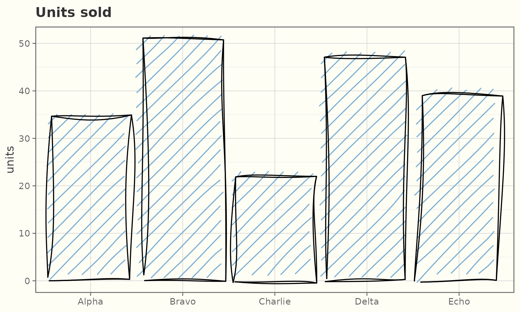
Map fill to a variable like any ggplot2 bar. Each bar
gets its own seed offset, so no two bars wobble identically.
ggplot(sales, aes(product, units, fill = product)) +
  geom_sketch_col(seed = 2L, show.legend = FALSE) +
  scale_fill_brewer(palette = "Set2") +
  labs(title = "Mapped fill", x = NULL) +
  theme_sketch()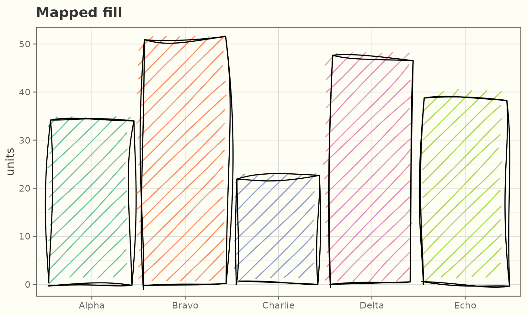
geom_sketch_bar() counts rows for you (like
geom_bar()):
ggplot(mpg, aes(class)) +
  geom_sketch_bar(fill = "#C39BD3", seed = 3L) +
  labs(title = "Vehicle count by class", x = NULL) +
  theme_sketch() +
  theme(axis.text.x = element_text(angle = 30, hjust = 1))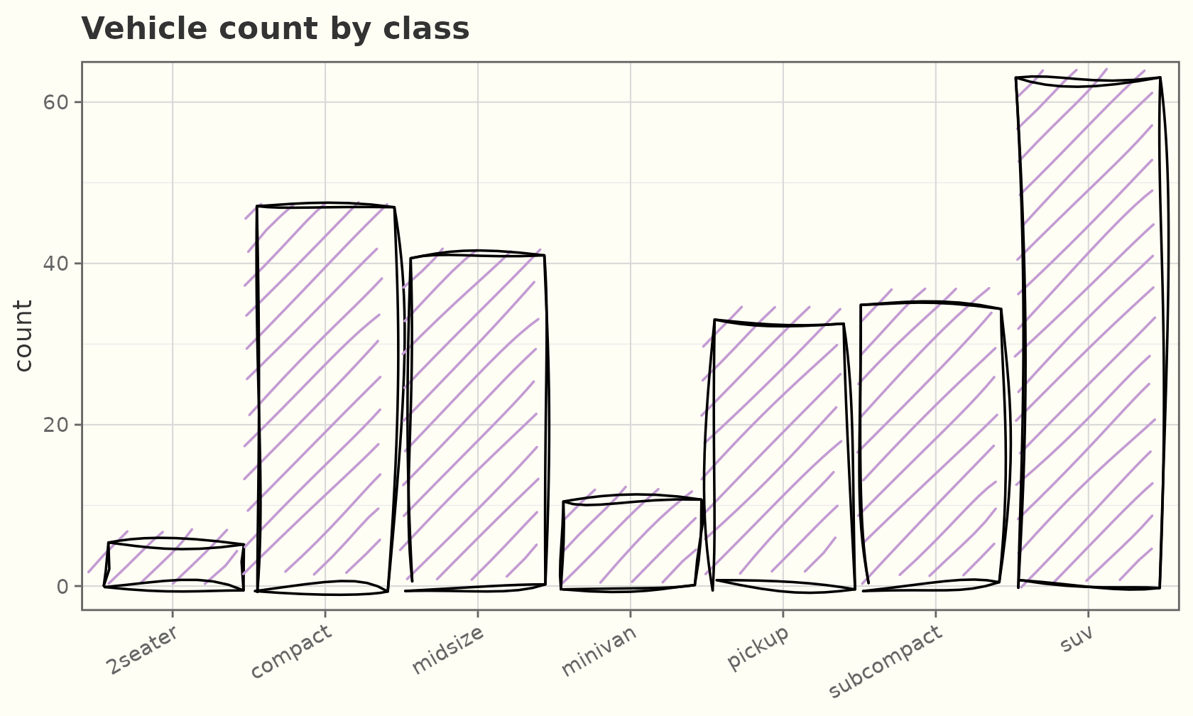
Bars flip and stack just like the originals:
ggplot(sales, aes(reorder(product, units), units)) +
  geom_sketch_col(fill = "#F1948A", seed = 1L) +
  coord_flip() +
  labs(title = "Horizontal bars", x = NULL) +
  theme_sketch()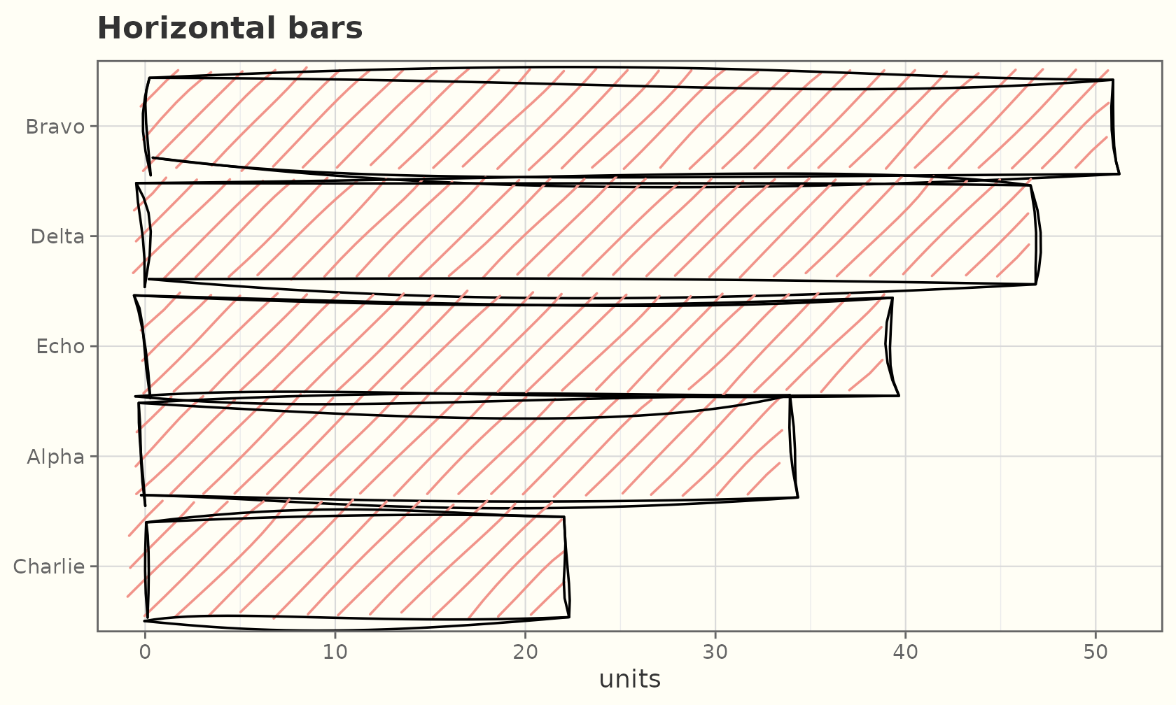
Histograms and frequency polygons
geom_sketch_histogram() bins a continuous variable and
draws hand-drawn bars; geom_sketch_freqpoly() draws the
same counts as a roughened line.
ggplot(faithful, aes(eruptions)) +
  geom_sketch_histogram(fill = "#7BAFD4", bins = 20, seed = 1L) +
  labs(title = "Old Faithful eruption times") +
  theme_sketch()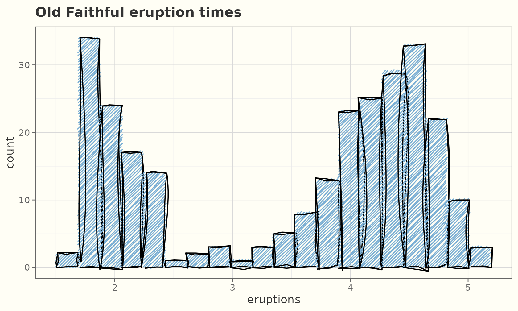
ggplot(mpg, aes(hwy, colour = drv)) +
  geom_sketch_freqpoly(bins = 15, linewidth = 0.9, seed = 2L) +
  labs(title = "Highway mpg by drivetrain", x = "hwy") +
  theme_sketch()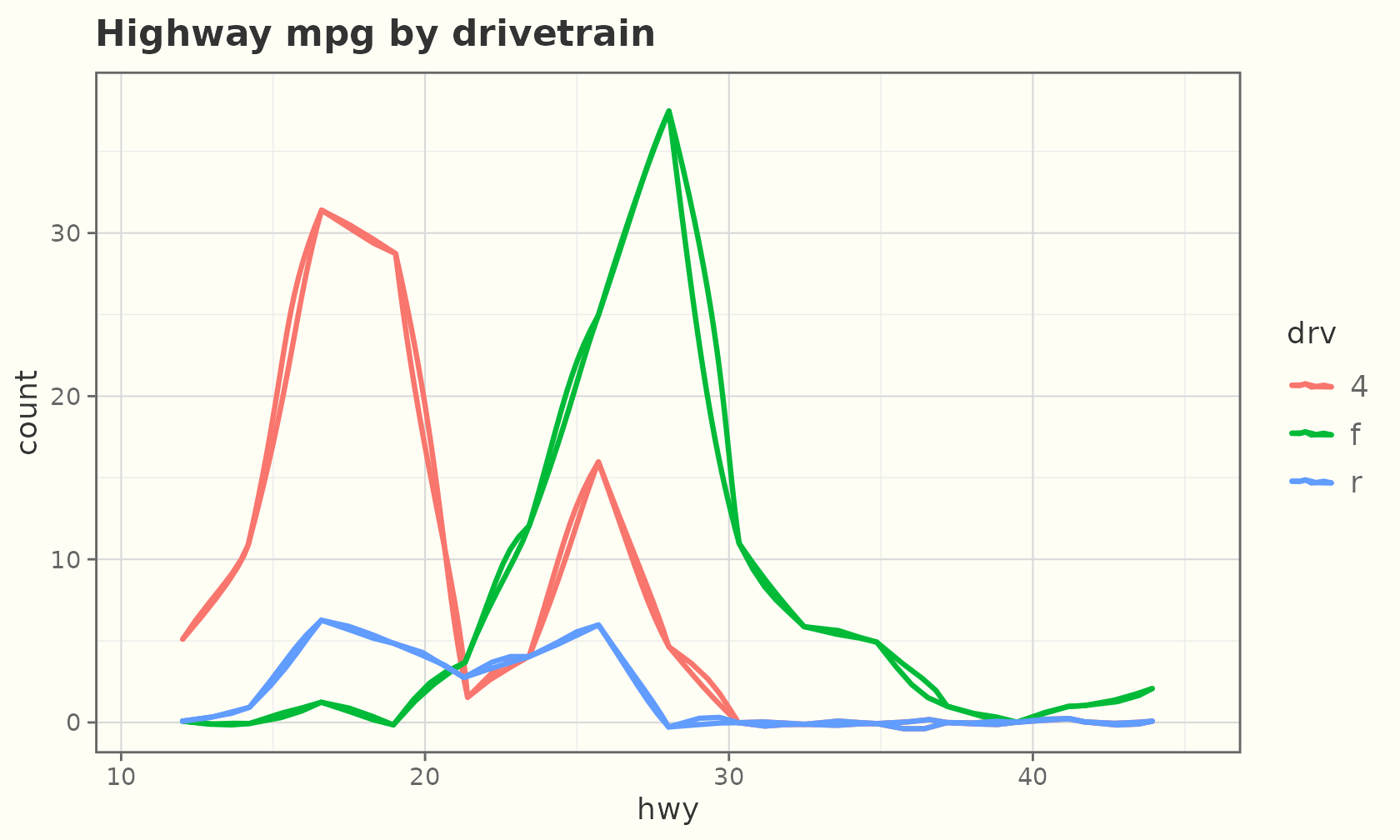
Lines, paths, and points
econ <- economics[economics$date > as.Date("2000-01-01"), ]
ggplot(econ, aes(date, unemploy)) +
  geom_sketch_line(colour = "steelblue", linewidth = 0.8, seed = 1L) +
  labs(title = "US unemployment", x = NULL, y = "thousands") +
  theme_sketch()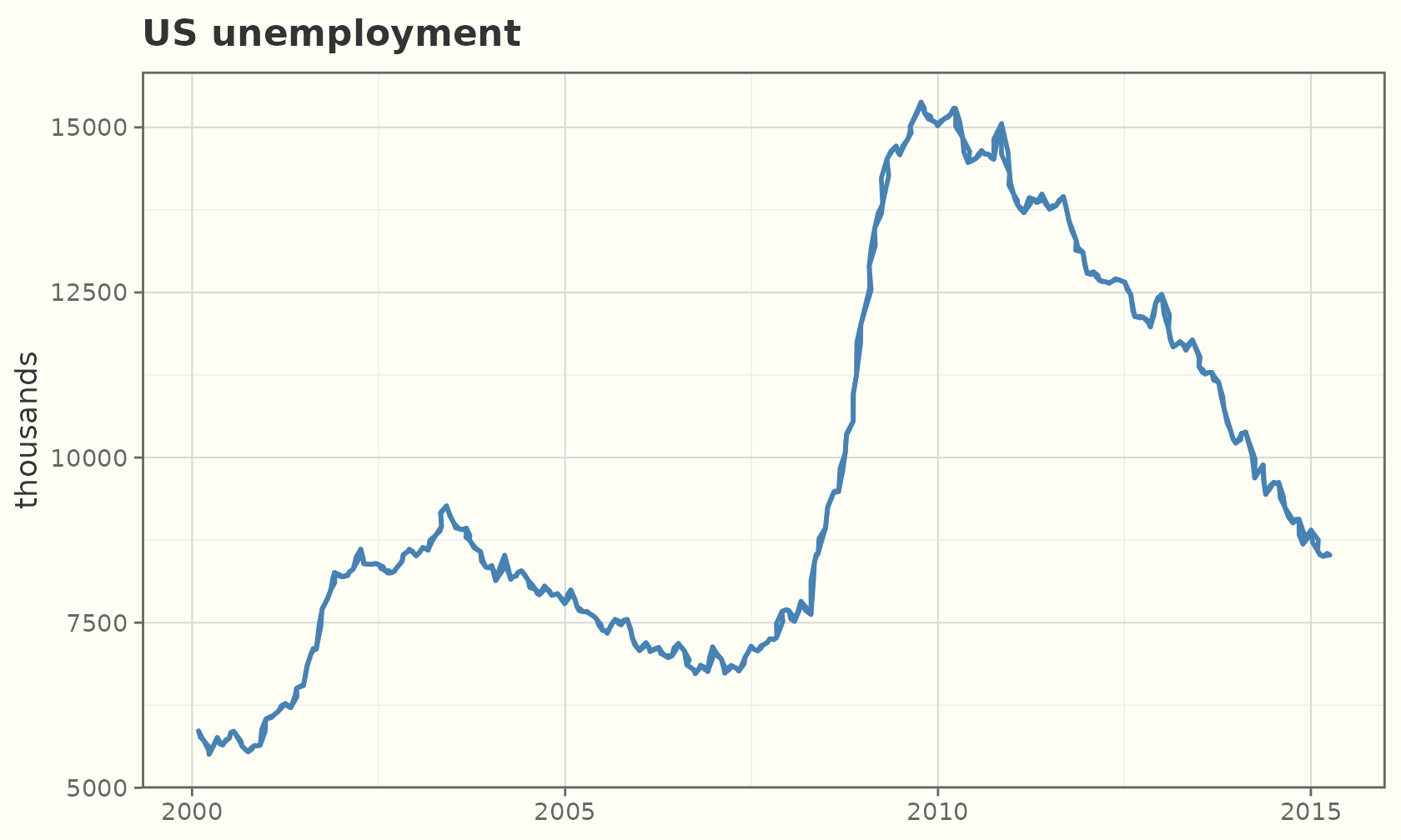
geom_sketch_point() draws each point as a small
roughened ellipse:
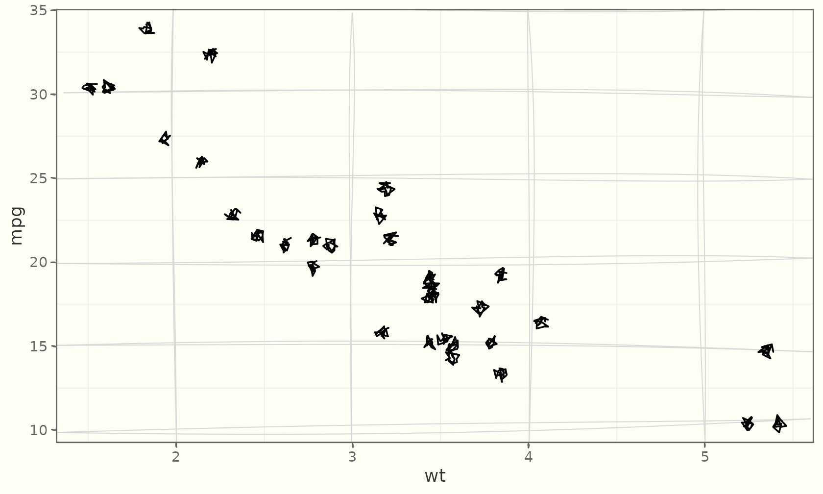
ggplot(mtcars, aes(wt, mpg, colour = factor(cyl))) +
  geom_sketch_point(size = 4, seed = 1L) +
  scale_colour_brewer("cylinders", palette = "Dark2") +
  labs(title = "Fuel economy vs weight") +
  theme_sketch()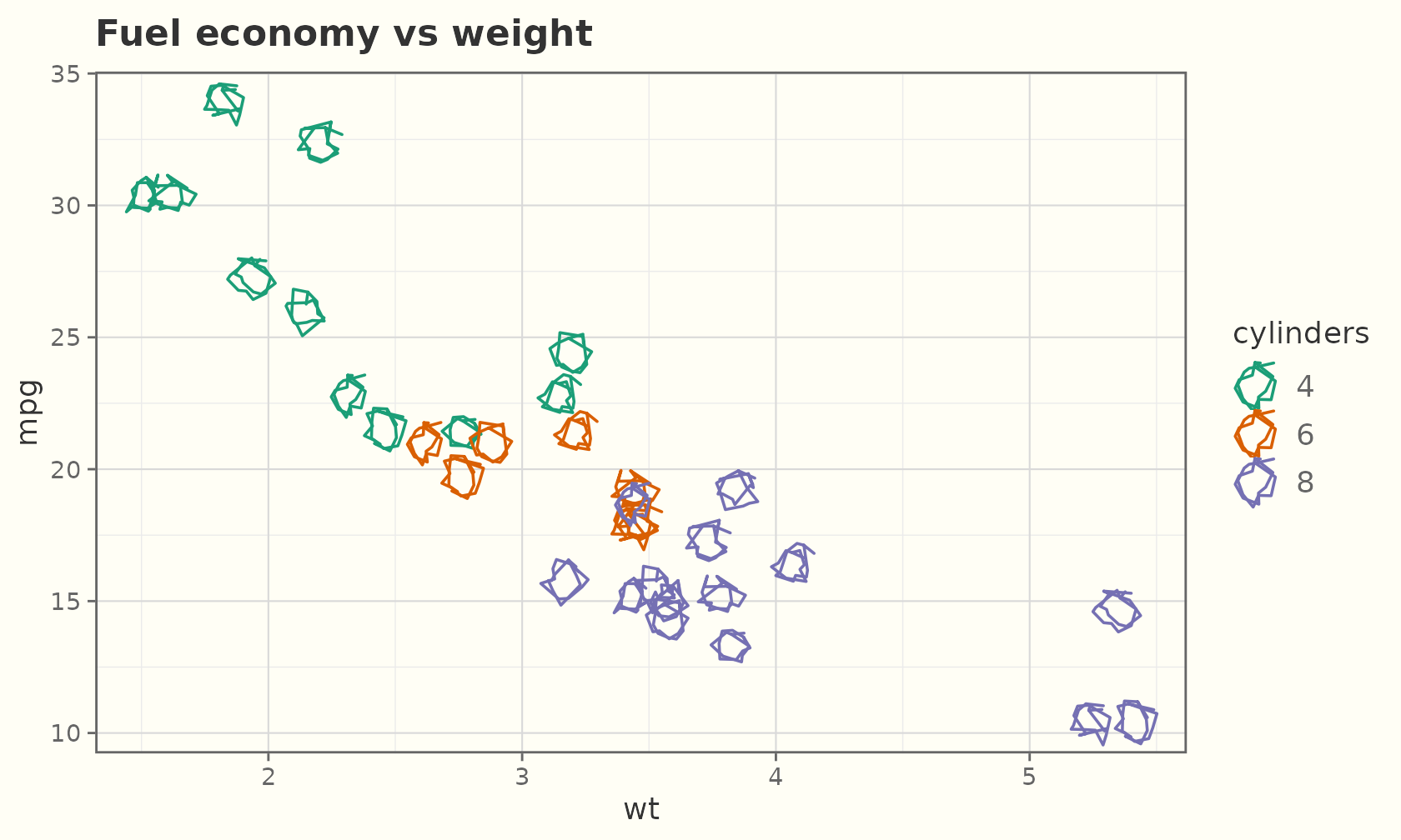
Lines and points compose like any layers:
df <- data.frame(x = 1:12, y = c(3, 5, 4, 7, 6, 9, 8, 11, 9, 12, 11, 14))
ggplot(df, aes(x, y)) +
  geom_sketch_line(colour = "grey40", seed = 3L) +
  geom_sketch_point(size = 4, colour = "firebrick", seed = 8L) +
  labs(title = "Trend with markers") +
  theme_sketch()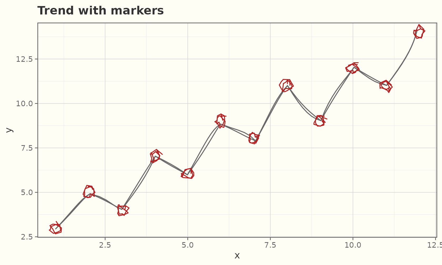
Multiple groups, one seed per group:
ggplot(ggplot2::economics_long, aes(date, value01, colour = variable)) +
  geom_sketch_line(seed = 5L) +
  labs(title = "Five series, hand-drawn", x = NULL, y = NULL) +
  theme_sketch()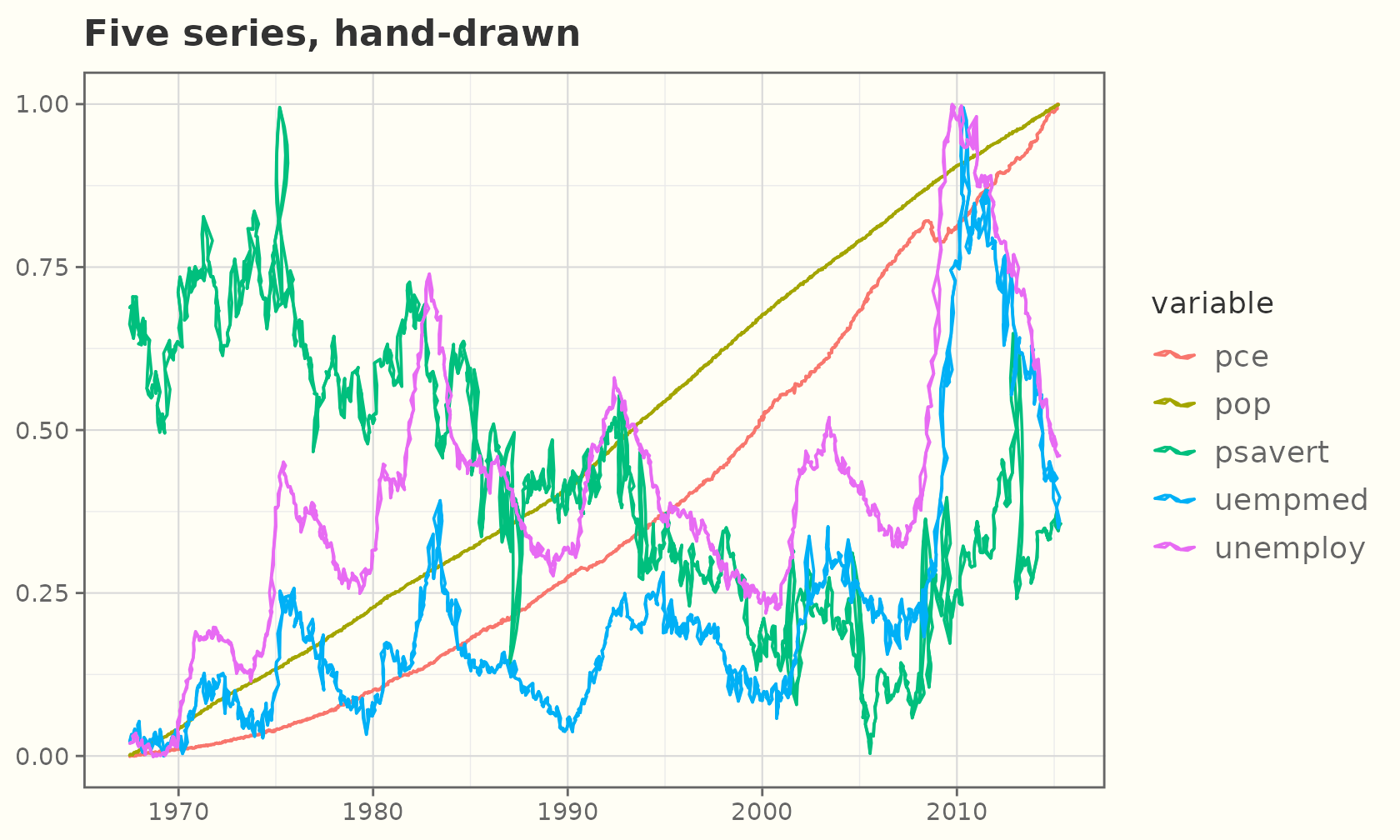
Point sizes
size behaves like any ggplot2 point size. Set it to a
constant for bigger or smaller markers:
sz <- data.frame(x = 1:5, y = 1, s = c(2, 4, 6, 9, 13))
ggplot(sz, aes(x, y)) +
  geom_sketch_point(size = sz$s, colour = "#2E86C1", seed = 1L) +
  labs(title = "Fixed point sizes (2 → 13)", x = NULL, y = NULL) +
  theme_sketch()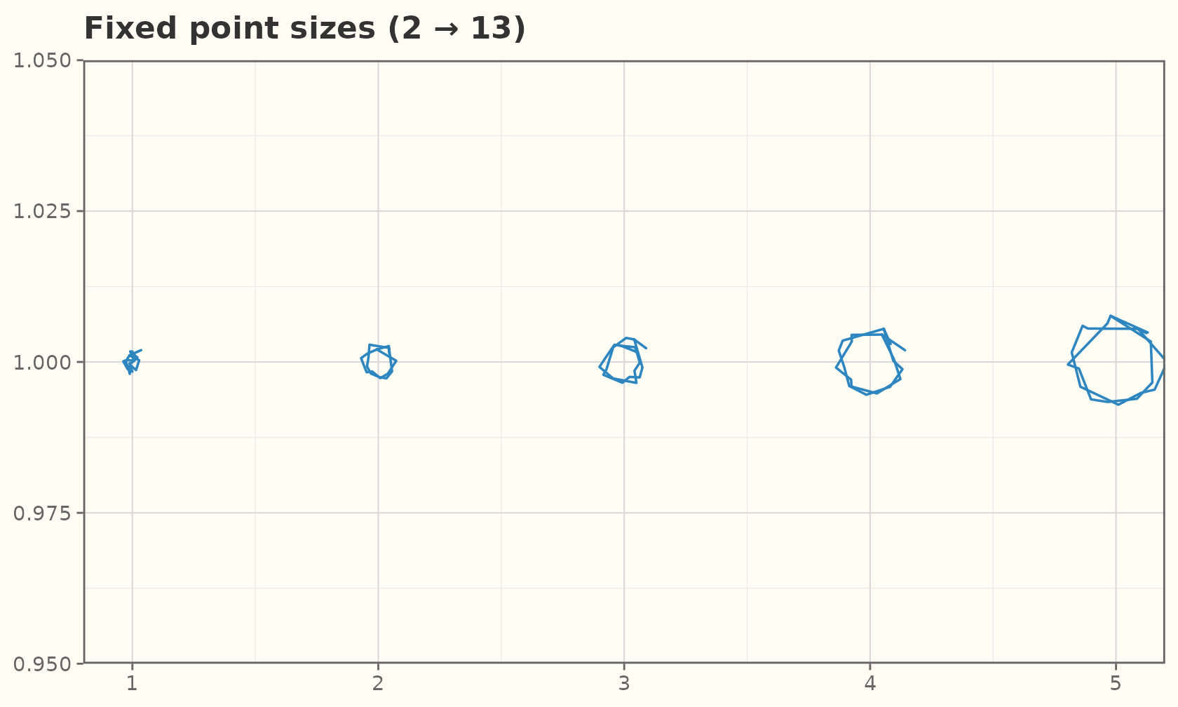
Or map size to a variable for a bubble chart — pair it
with scale_size_area() so the area (not radius)
encodes the value:
ggplot(mtcars, aes(wt, mpg, size = hp, colour = factor(cyl))) +
  geom_sketch_point(alpha = 0.9, seed = 2L) +
  scale_size_area("horsepower", max_size = 14) +
  scale_colour_brewer("cylinders", palette = "Dark2") +
  labs(title = "Bubble chart: size = horsepower") +
  theme_sketch()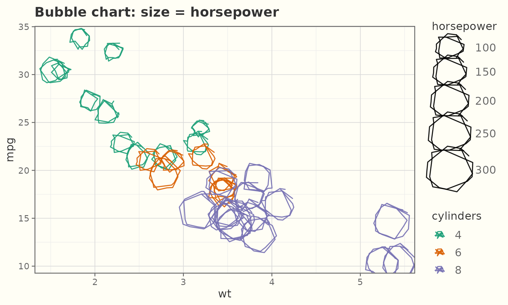
A small-multiples sweep of a single size aesthetic:
grid <- expand.grid(x = 1:6, y = 1:3)
grid$s <- seq(1.5, 11, length.out = nrow(grid))
ggplot(grid, aes(x, y, size = s)) +
  geom_sketch_point(colour = "#884EA0", show.legend = FALSE, seed = 3L) +
  scale_size_identity() +
  labs(title = "Increasing point size", x = NULL, y = NULL) +
  theme_sketch()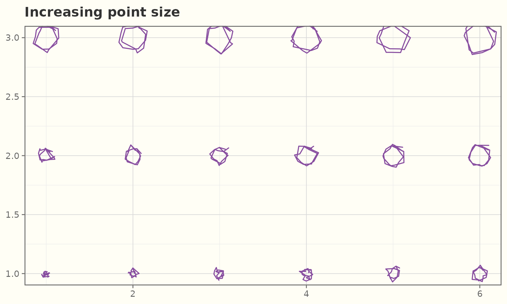
Point roughness
For geom_sketch_point(), roughness is a
mappable aesthetic. As a constant it sets how wobbly every
marker is — from clean circles up to very shaky:
rg <- data.frame(x = 1:4, y = 1, r = c(0, 0.4, 0.9, 1.6))
ggplot(rg, aes(x, y)) +
  geom_sketch_point(aes(roughness = I(r)), size = 14, colour = "#2E86C1",
                    seed = 1L) +
  geom_sketch_text(aes(label = r), nudge_y = -0.5, size = 6) +
  labs(title = "roughness 0 → 1.6 (constant per point)",
       x = NULL, y = NULL) +
  ylim(0.3, 1.3) +
  theme_sketch() +
  theme(axis.text = element_blank())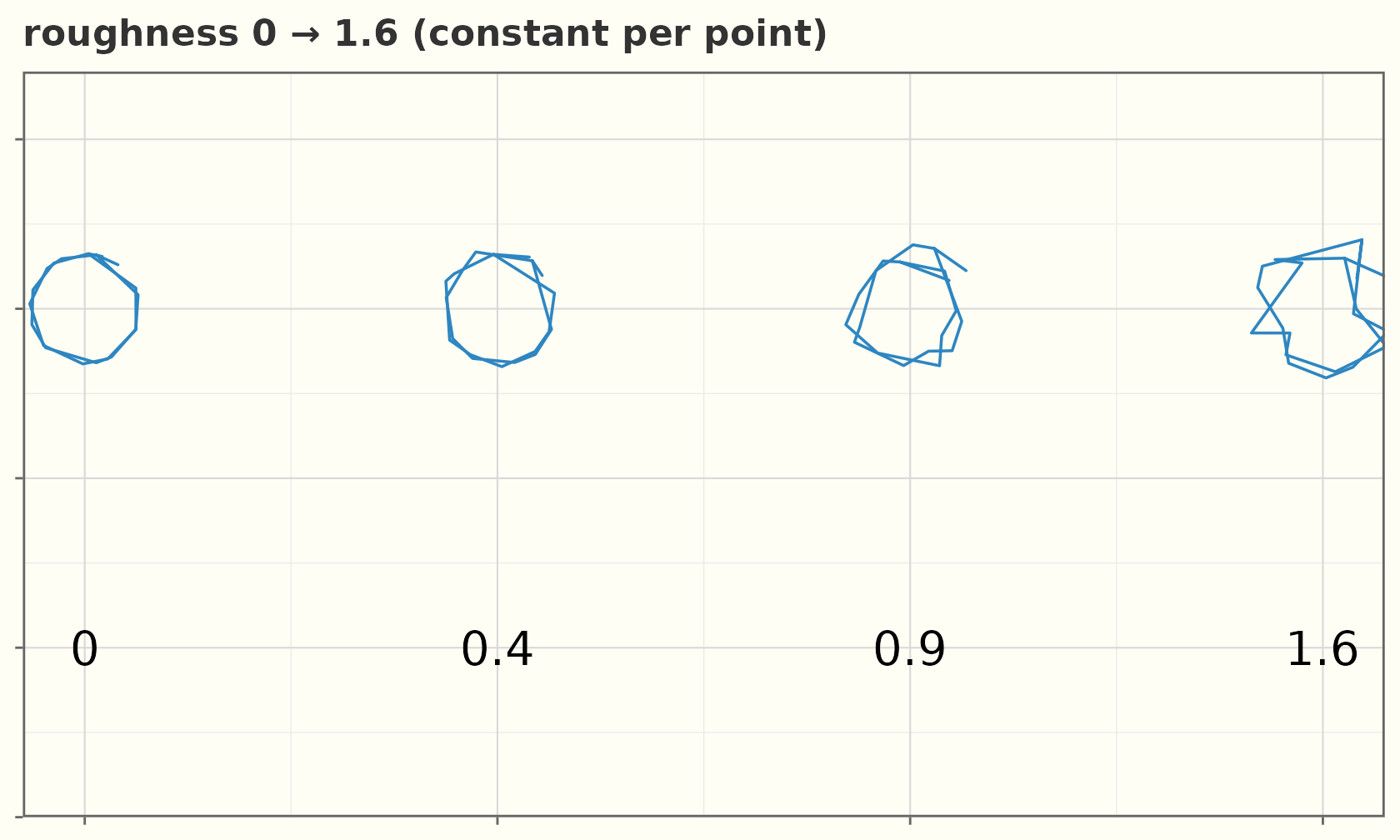
Map it to a variable and the values are rescaled to a legible band by
scale_roughness_continuous() (applied automatically,
default c(0.01, 0.75)), so points can encode a third
variable through how shaky they look:
ggplot(mtcars, aes(wt, mpg, roughness = hp, colour = factor(cyl))) +
  geom_sketch_point(size = 4, seed = 1L) +
  scale_colour_brewer("cylinders", palette = "Dark2") +
  labs(title = "roughness mapped to horsepower") +
  theme_sketch()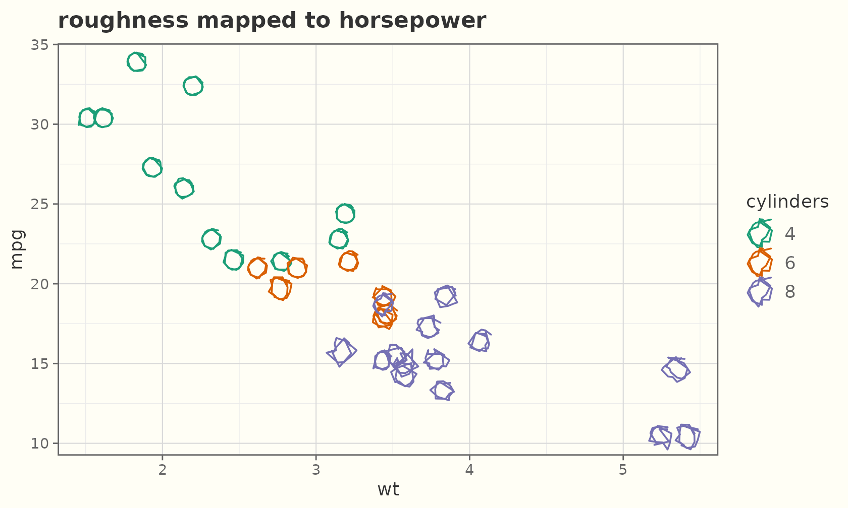
Use I() to pass raw roughness through unscaled, or
scale_roughness_continuous(range = ...) to widen the
band.
Jitter and count
geom_sketch_jitter() spreads overplotted points;
geom_sketch_count() sizes a single point by how many
observations sit there.
ggplot(mpg, aes(class, hwy)) +
  geom_sketch_jitter(width = 0.2, height = 0, colour = "#5D6D7E",
                     size = 2, seed = 1L) +
  labs(title = "Jittered highway mpg", x = NULL) +
  theme_sketch() +
  theme(axis.text.x = element_text(angle = 30, hjust = 1))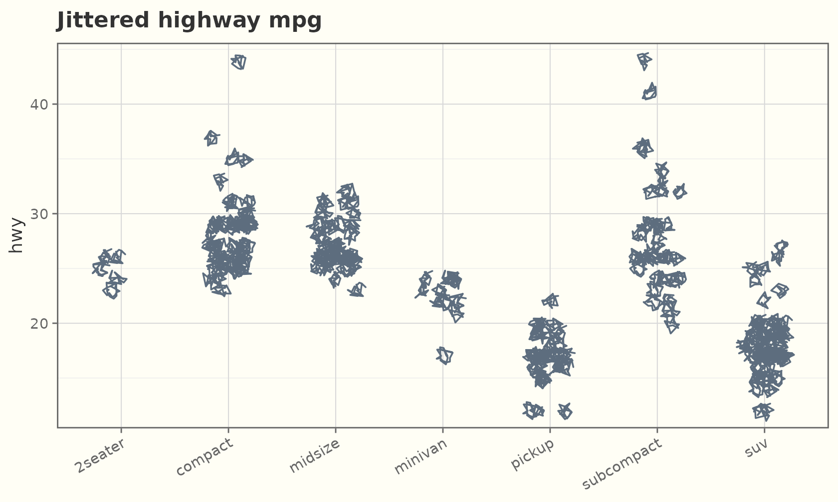
ggplot(mpg, aes(cty, hwy)) +
  geom_sketch_count(colour = "#C0392B", seed = 2L) +
  scale_size_area(max_size = 8) +
  labs(title = "Overplot count") +
  theme_sketch()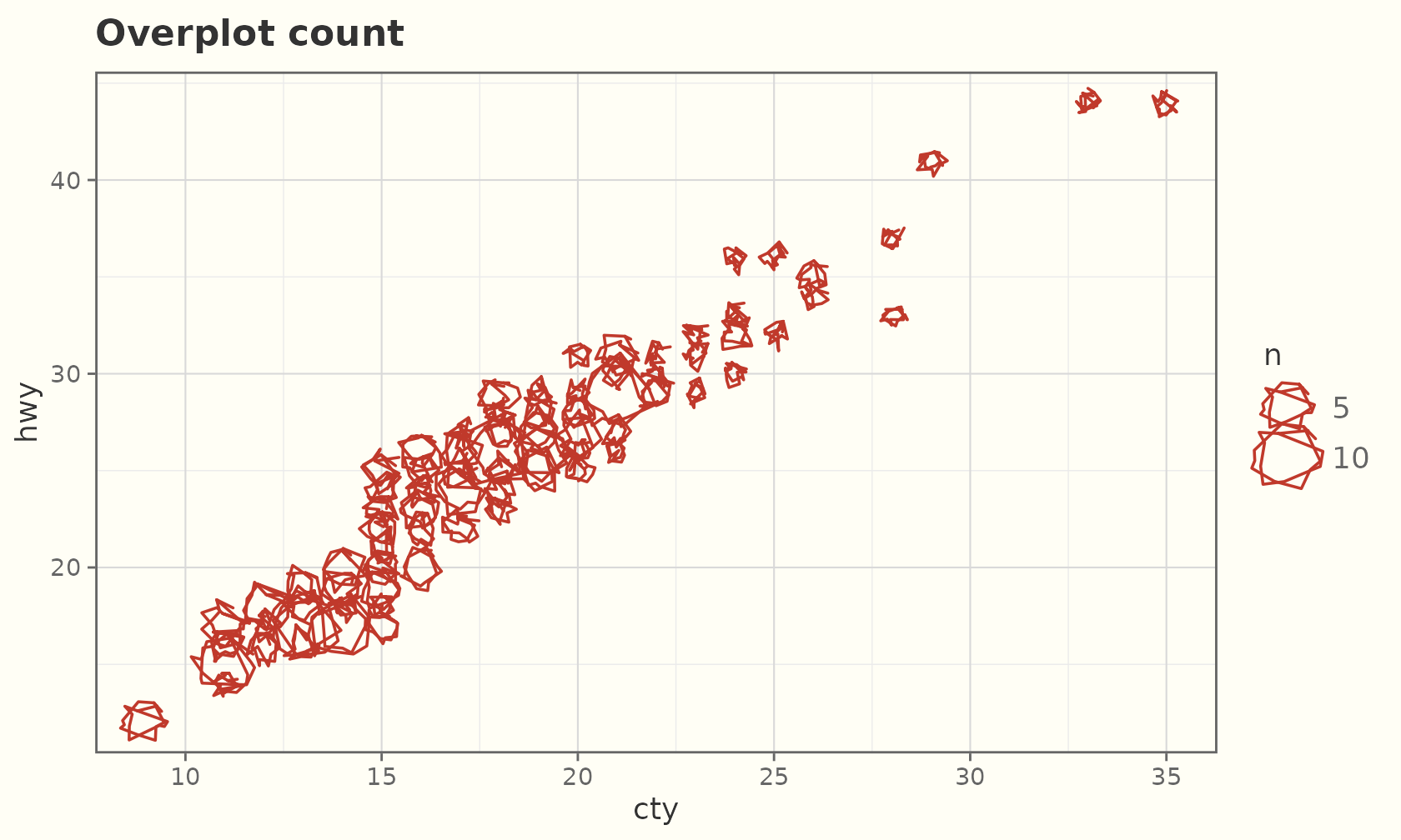
Rectangles and tiles
rects <- data.frame(xmin = c(1, 3, 5), xmax = c(2, 4, 6),
                    ymin = 0, ymax = c(2, 4, 3))
ggplot(rects) +
  geom_sketch_rect(aes(xmin = xmin, xmax = xmax, ymin = ymin, ymax = ymax,
                       fill = factor(xmin)),
                   seed = 1L, show.legend = FALSE) +
  labs(title = "geom_sketch_rect()") +
  theme_sketch()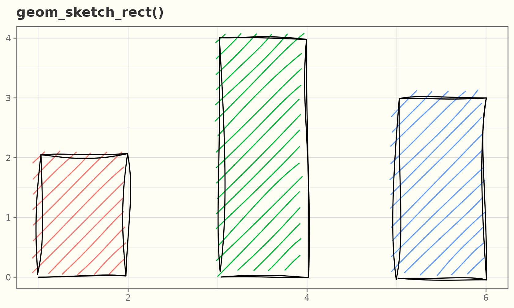
A sketchy heatmap with geom_sketch_tile():
td <- expand.grid(x = 1:8, y = 1:6)
td$z <- td$x + td$y
ggplot(td, aes(x, y, fill = z)) +
  geom_sketch_tile(seed = 2L, hachure_gap = 0.18) +
  scale_fill_viridis_c() +
  labs(title = "geom_sketch_tile()") +
  theme_sketch()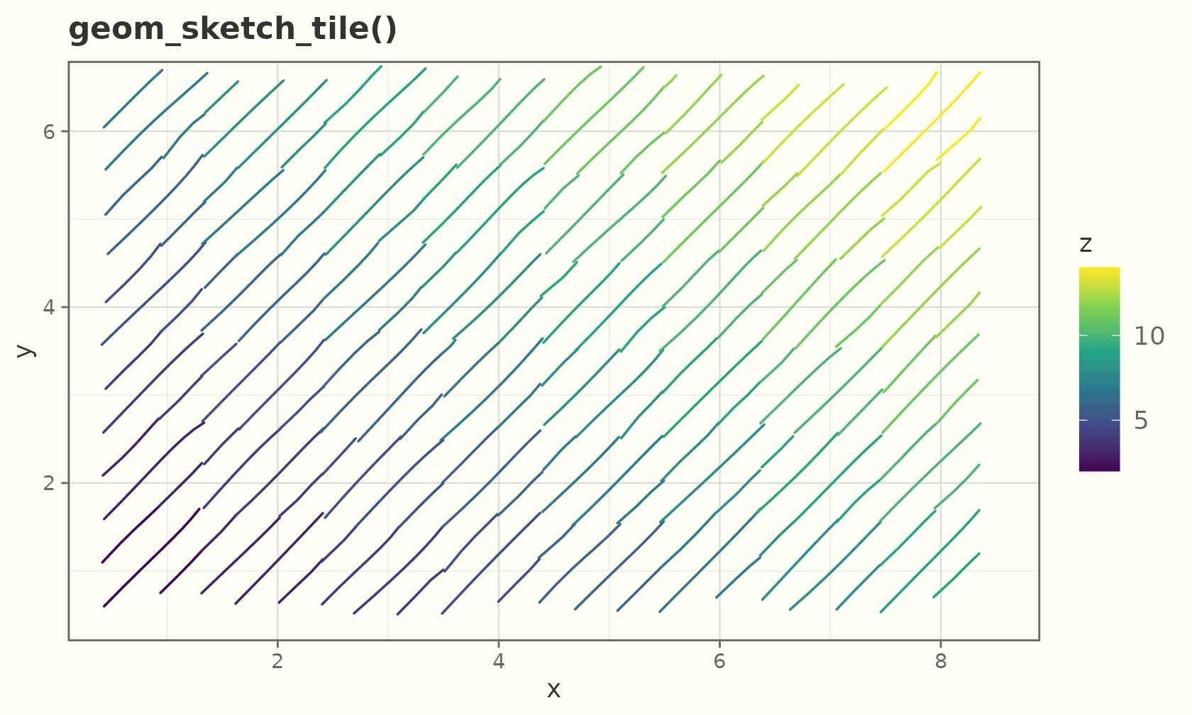
A sketchy 2-D bin heatmap with geom_sketch_bin2d()
(cells default to a hachure fill, shaded by count):
ggplot(faithful, aes(eruptions, waiting)) +
  geom_sketch_bin2d(bins = 12, seed = 3L) +
  scale_fill_viridis_c() +
  labs(title = "geom_sketch_bin2d()") +
  theme_sketch()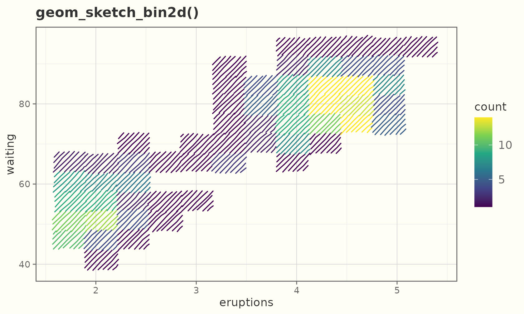
geom_sketch_hex() bins into hexagons instead (needs the
hexbin package):
ggplot(faithful, aes(eruptions, waiting)) +
  geom_sketch_hex(bins = 12, seed = 4L) +
  scale_fill_viridis_c(option = "magma") +
  labs(title = "geom_sketch_hex()") +
  theme_sketch()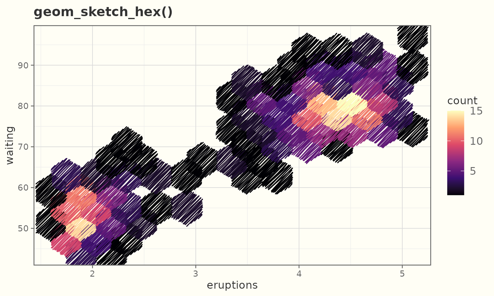
Polygons, ribbons, areas, and densities
Concave polygons fill correctly (the hachure respects every notch):
ang  <- seq(0, 2 * pi, length.out = 11)[-11]
r    <- rep(c(1, 0.45), length.out = 10)
star <- data.frame(x = r * cos(ang), y = r * sin(ang))
ggplot(star, aes(x, y)) +
  geom_sketch_polygon(fill = "tomato", seed = 1L) +
  coord_equal() +
  labs(title = "A concave star") +
  theme_sketch()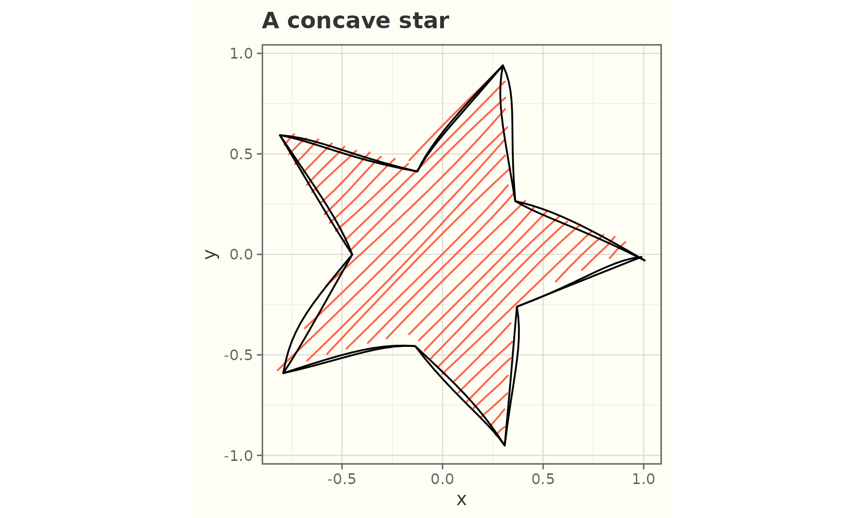
band <- data.frame(x = 1:20)
band$y  <- 10 + 5 * sin(seq(0, 3 * pi, length.out = 20))
band$lo <- band$y - 2
band$hi <- band$y + 2

ggplot(band, aes(x)) +
  geom_sketch_ribbon(aes(ymin = lo, ymax = hi), fill = "plum", seed = 2L) +
  geom_sketch_line(aes(y = y), seed = 3L) +
  labs(title = "Ribbon + line") +
  theme_sketch()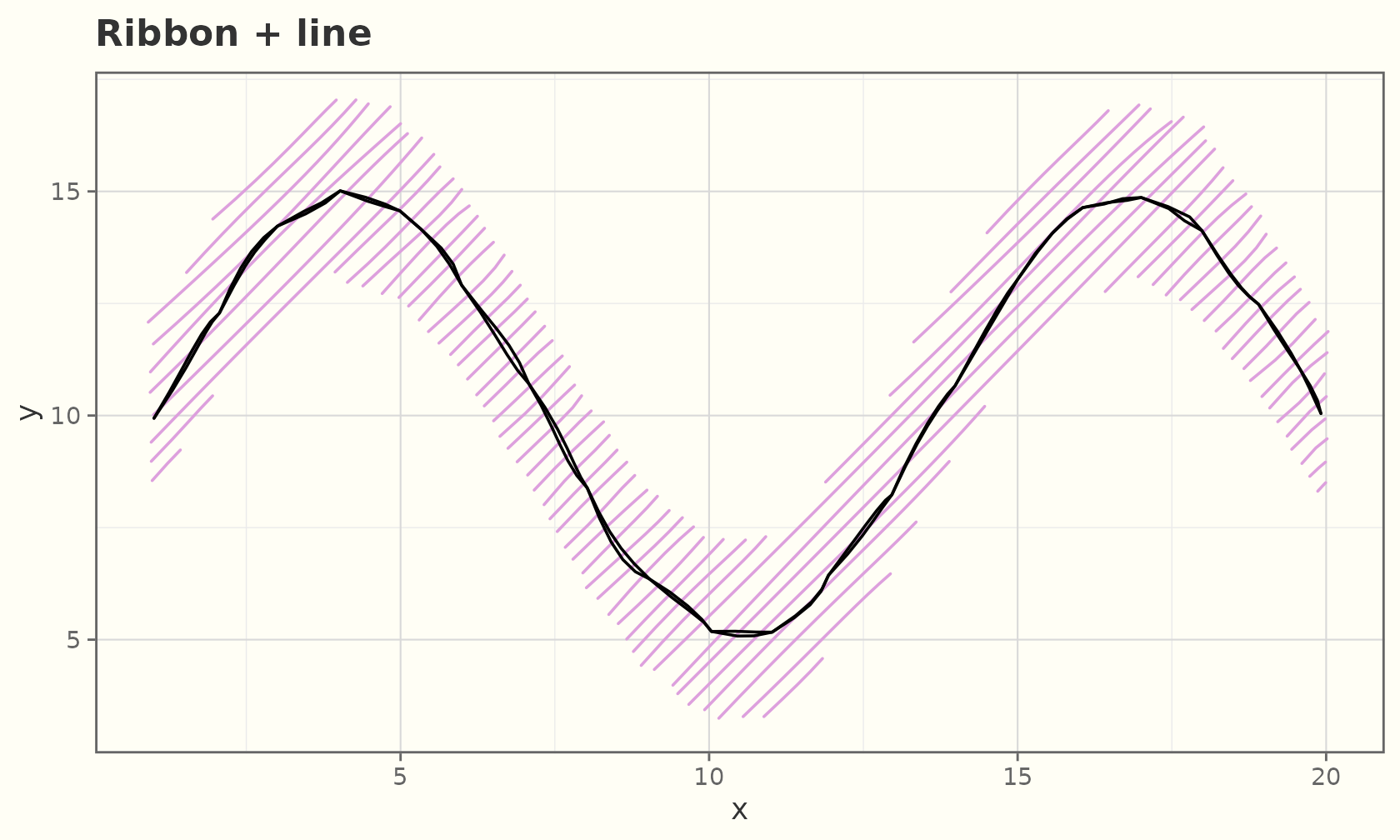
ggplot(band, aes(x, y)) +
  geom_sketch_area(fill = "lightgreen", seed = 3L) +
  labs(title = "geom_sketch_area()") +
  theme_sketch()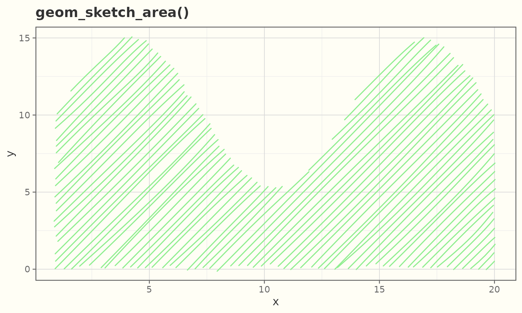
ggplot(faithful, aes(eruptions)) +
  geom_sketch_density(fill = "khaki", seed = 4L) +
  labs(title = "Old Faithful eruptions") +
  theme_sketch()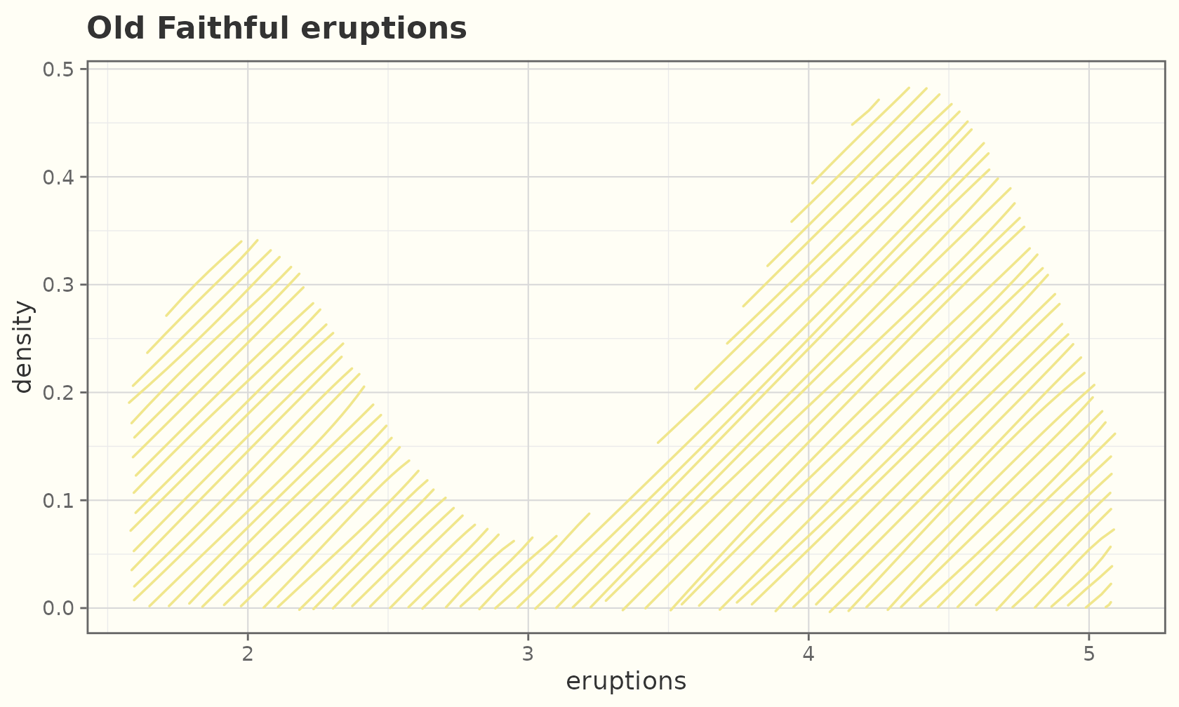
Violins
geom_sketch_violin() mirrors a kernel density into a
closed polygon and hachure-fills it.
ggplot(mpg, aes(class, hwy, fill = class)) +
  geom_sketch_violin(seed = 1L, show.legend = FALSE) +
  scale_fill_brewer(palette = "Set3") +
  labs(title = "Highway mpg distribution by class", x = NULL) +
  theme_sketch() +
  theme(axis.text.x = element_text(angle = 30, hjust = 1))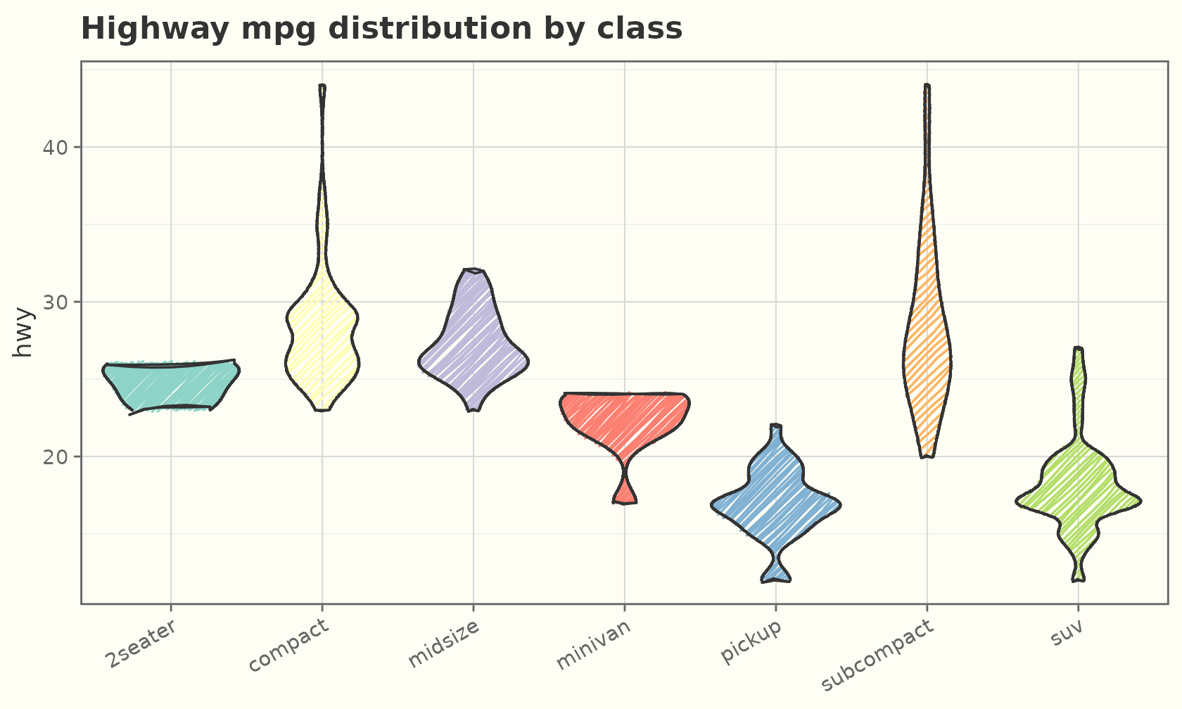
Smooths
A hand-drawn fit with a roughened confidence band:
ggplot(mtcars, aes(wt, mpg)) +
  geom_sketch_point(seed = 1L) +
  geom_sketch_smooth(method = "lm", formula = y ~ x, seed = 2L) +
  labs(title = "Linear fit with CI band") +
  theme_sketch()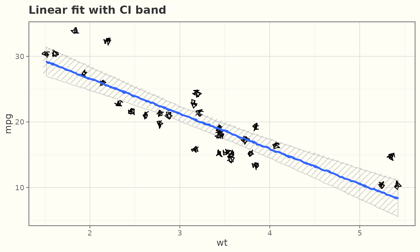
ggplot(mpg, aes(displ, hwy)) +
  geom_sketch_point(colour = "grey50", seed = 1L) +
  geom_sketch_smooth(seed = 2L, colour = "darkorange") +
  labs(title = "loess fit") +
  theme_sketch()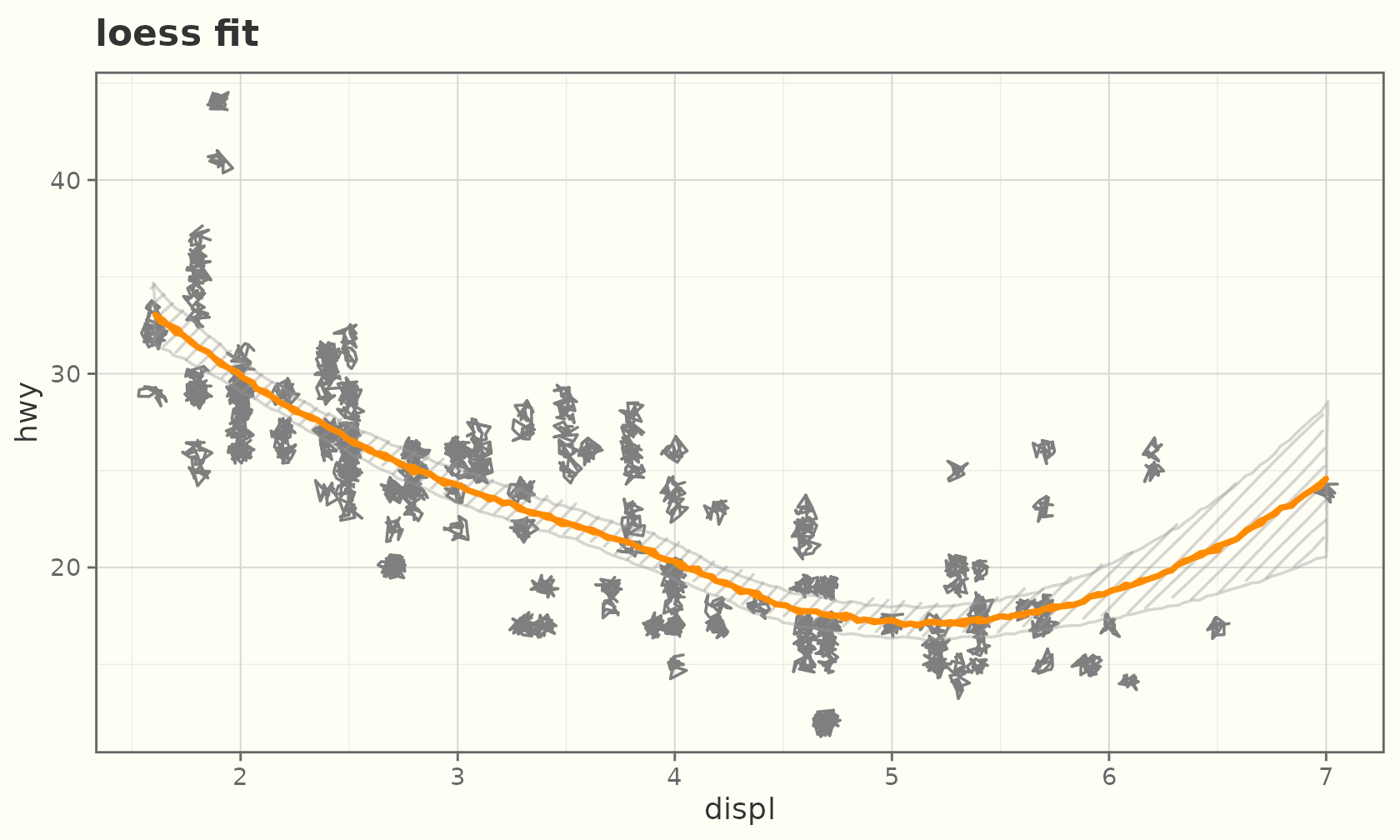
Function curves
geom_sketch_function() sketches an analytic curve over
the x range, for example to overlay a theoretical density.
ggplot(data.frame(x = c(-4, 4)), aes(x)) +
  geom_sketch_function(fun = dnorm, colour = "#2E86C1", linewidth = 0.9,
                       seed = 1L) +
  geom_sketch_function(fun = dnorm, args = list(sd = 1.6),
                       colour = "#C0392B", linewidth = 0.9, seed = 2L) +
  labs(title = "Two normal densities", y = "density") +
  theme_sketch()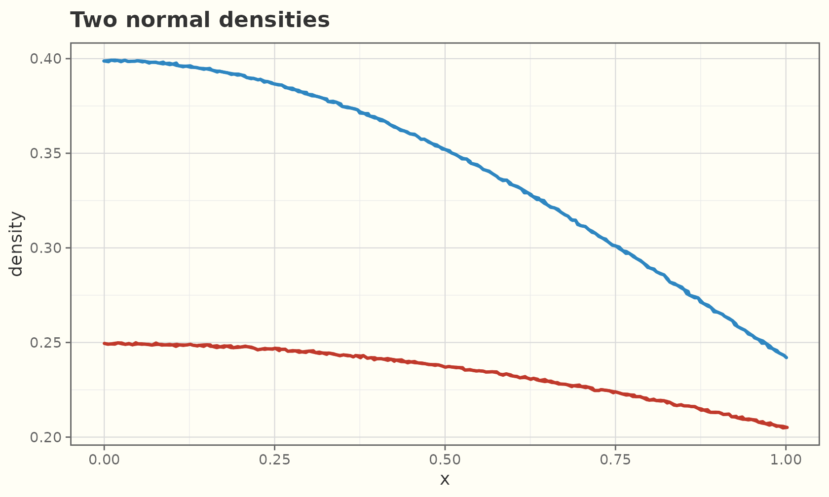
Q-Q plots
geom_sketch_qq() draws the quantile-quantile points and
geom_sketch_qq_line() the reference line. Map data to the
sample aesthetic.
ggplot(mtcars, aes(sample = mpg)) +
  geom_sketch_qq(size = 2.5, seed = 1L) +
  geom_sketch_qq_line(colour = "#C8553D", linewidth = 0.8, seed = 2L) +
  labs(title = "Normal Q-Q plot of mpg", x = "theoretical", y = "sample") +
  theme_sketch()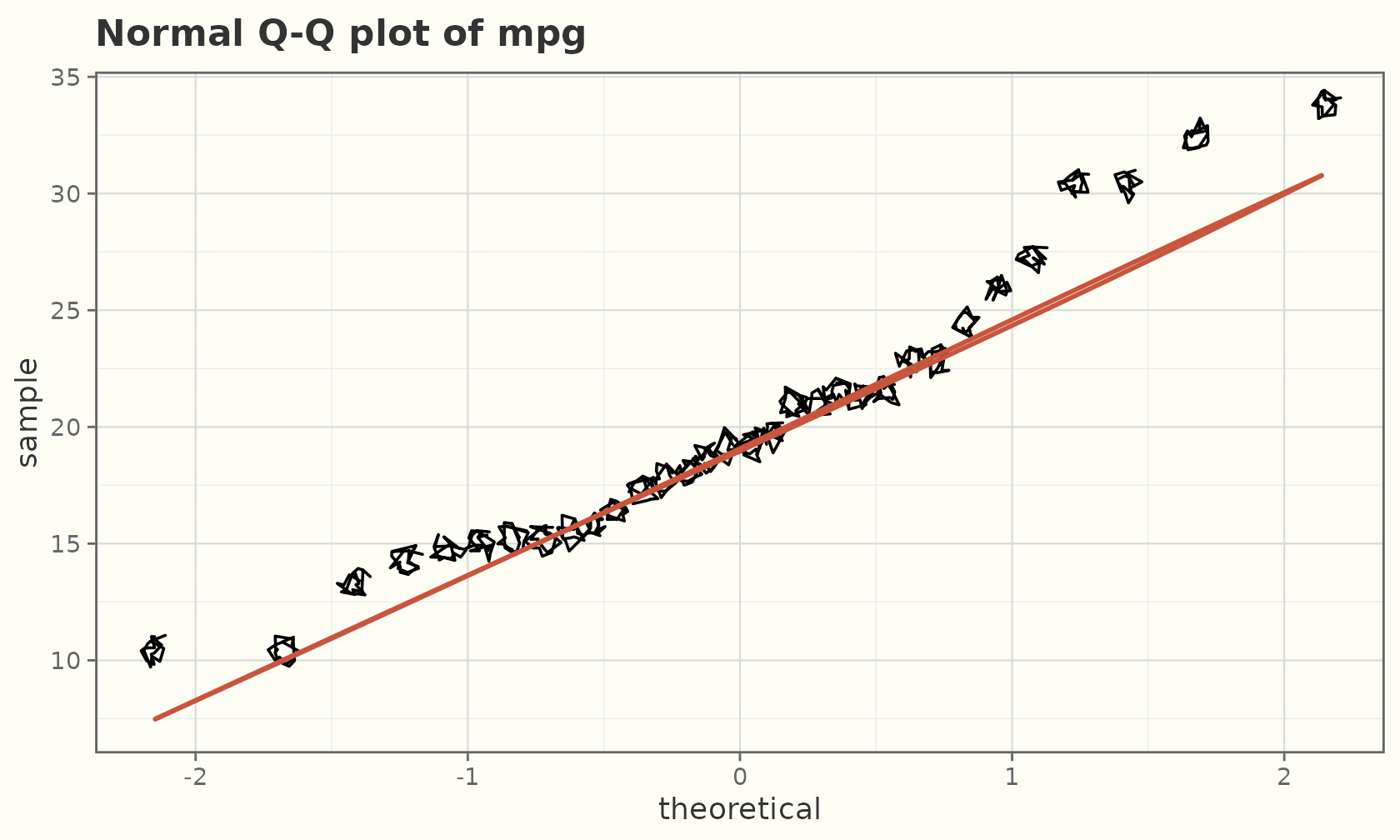
Quantile regression
geom_sketch_quantile() fits and draws quantile
regression lines (requires the optional quantreg
package).
ggplot(mpg, aes(displ, hwy)) +
  geom_sketch_point(colour = "grey60", seed = 1L) +
  geom_sketch_quantile(quantiles = c(0.1, 0.5, 0.9), colour = "#6C3483",
                       linewidth = 0.9, seed = 2L) +
  labs(title = "10th / 50th / 90th percentile fits") +
  theme_sketch()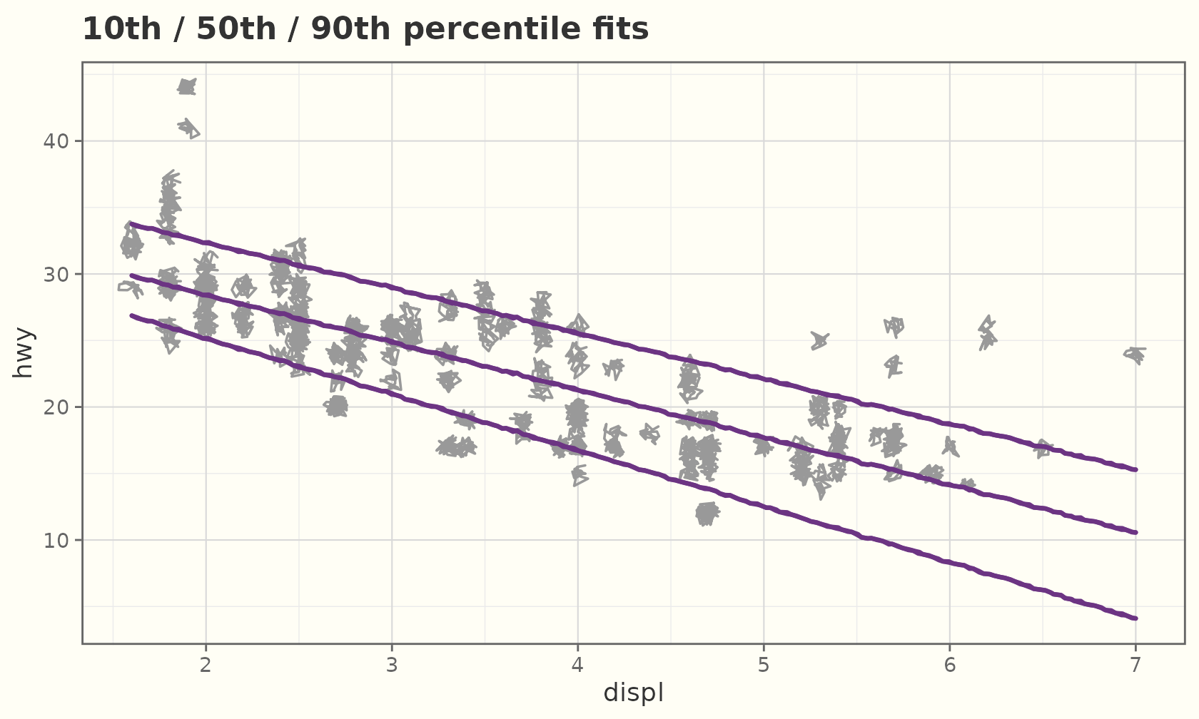
Circles and ellipses
Radii are in data units, so use coord_equal() for true
circles:
cdf <- data.frame(x = c(1, 3, 2), y = c(1, 1, 2.5),
                  r = c(0.6, 0.9, 0.5), grp = c("a", "b", "c"))
ggplot(cdf, aes(x, y, r = r, fill = grp)) +
  geom_sketch_circle(seed = 1L, show.legend = FALSE) +
  coord_equal() +
  labs(title = "geom_sketch_circle()") +
  theme_sketch()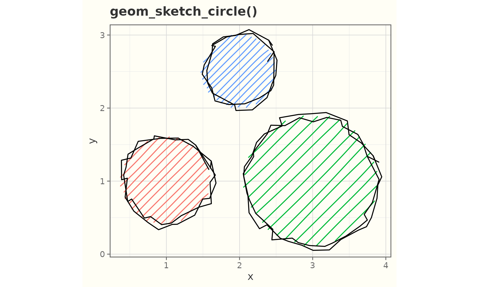
edf <- data.frame(x = c(1, 3), y = c(1, 2), a = c(1.4, 0.8), b = c(0.6, 1.2))
ggplot(edf, aes(x, y, a = a, b = b, fill = factor(x))) +
  geom_sketch_ellipse(seed = 2L, show.legend = FALSE) +
  coord_equal() +
  labs(title = "geom_sketch_ellipse()") +
  theme_sketch()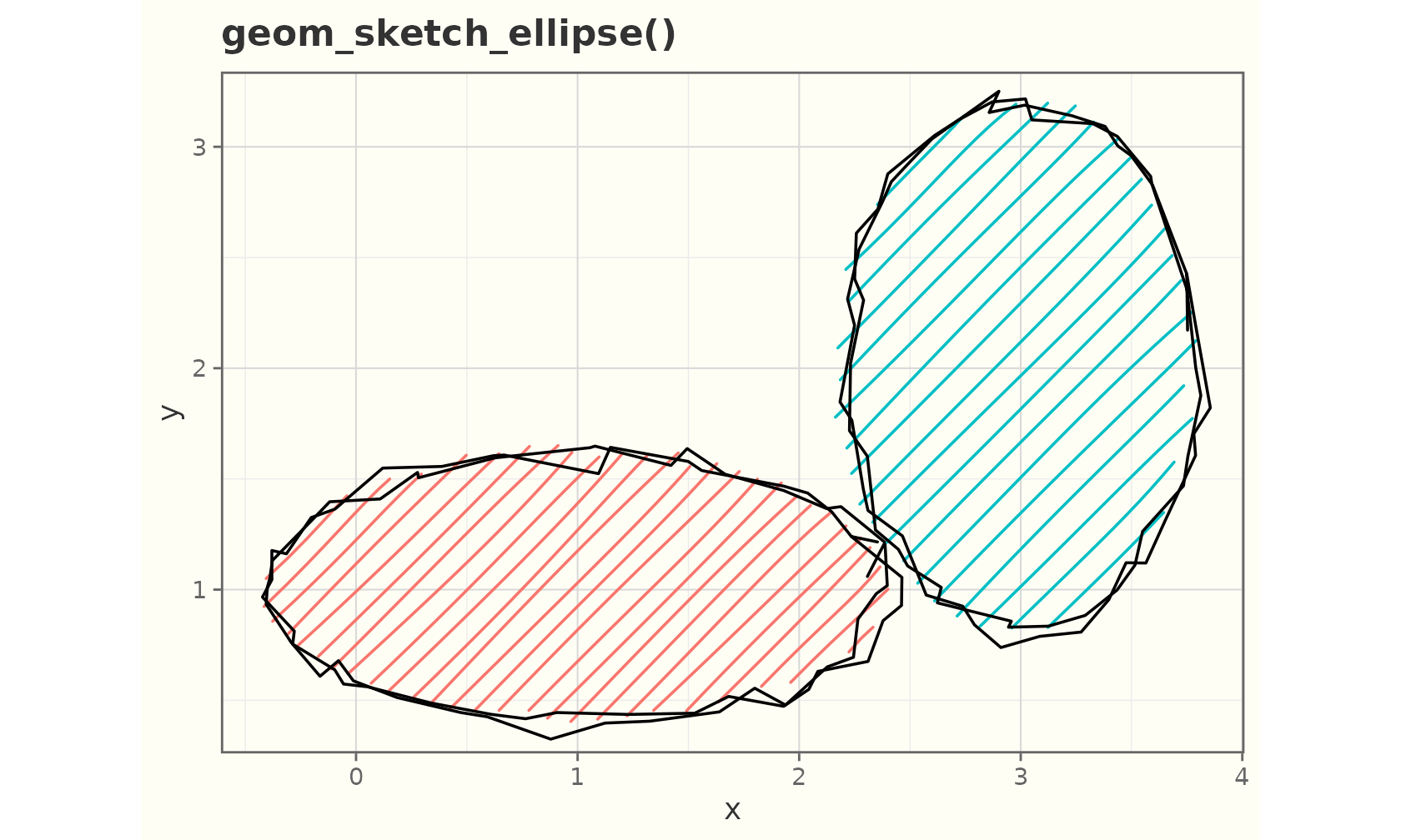
Segments and steps
sdf <- data.frame(x = 1:4, y = c(1, 3, 2, 4),
                  xend = 2:5, yend = c(3, 1, 4, 2))
ggplot(sdf) +
  geom_sketch_segment(aes(x = x, y = y, xend = xend, yend = yend),
                      colour = "darkgreen", linewidth = 1, seed = 3L) +
  labs(title = "geom_sketch_segment()") +
  theme_sketch()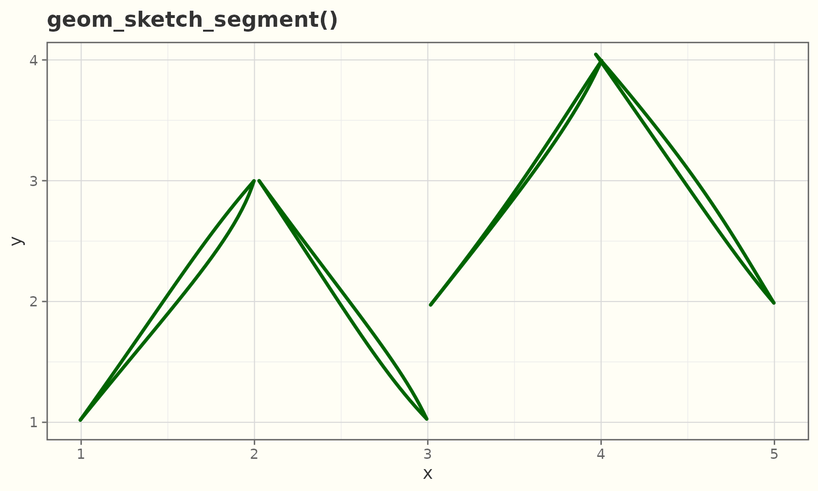
stp <- data.frame(x = 1:8, y = c(1, 3, 2, 5, 4, 6, 5, 8))
ggplot(stp, aes(x, y)) +
  geom_sketch_step(colour = "purple", linewidth = 1, seed = 4L) +
  geom_sketch_point(seed = 5L) +
  labs(title = "geom_sketch_step()") +
  theme_sketch()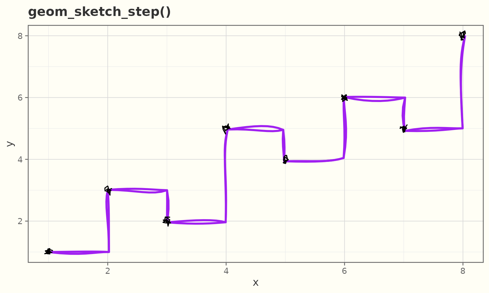
Curves and spokes
geom_sketch_curve() is a curved connector (a quadratic
Bézier); curvature sets how much it bends.
cdf <- data.frame(x = c(1, 1, 1), y = c(1, 2, 3),
                  xend = c(4, 4, 4), yend = c(1, 2, 3))
ggplot(cdf, aes(x, y)) +
  geom_sketch_curve(aes(xend = xend, yend = yend), curvature = 0.4,
                    colour = "#1A5276", linewidth = 0.9, seed = 1L) +
  geom_sketch_point(seed = 2L) +
  geom_sketch_point(aes(x = xend, y = yend), seed = 3L) +
  labs(title = "geom_sketch_curve()") +
  theme_sketch()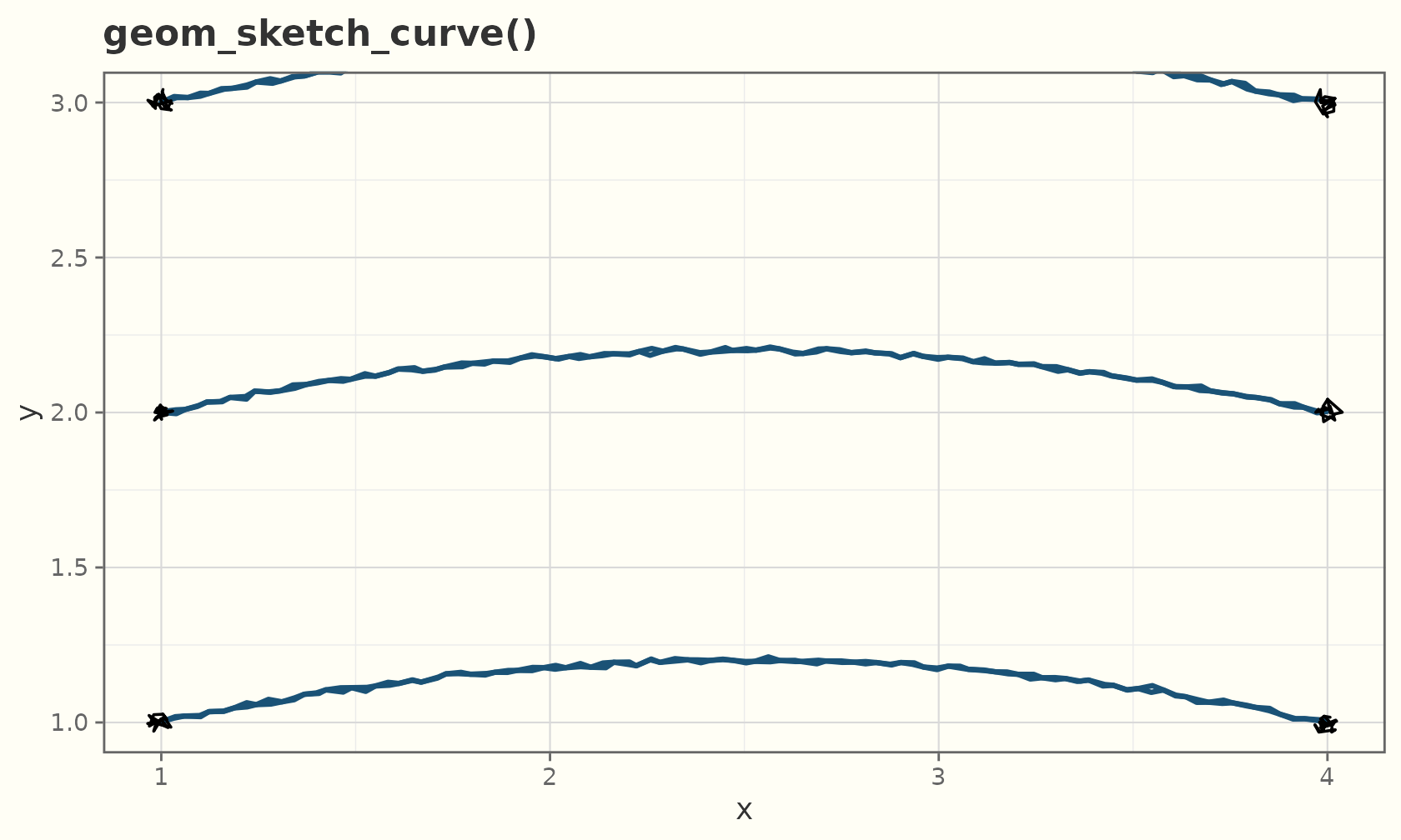
geom_sketch_spoke() draws a segment from each point by
angle and radius — useful for vector
fields.
field <- expand.grid(x = 1:6, y = 1:6)
field$angle  <- with(field, atan2(y - 3.5, x - 3.5))
field$radius <- 0.6
ggplot(field, aes(x, y)) +
  geom_sketch_spoke(aes(angle = angle, radius = radius),
                    colour = "#117A65", seed = 1L) +
  geom_sketch_point(size = 1.5, seed = 2L) +
  coord_equal() +
  labs(title = "geom_sketch_spoke()") +
  theme_sketch()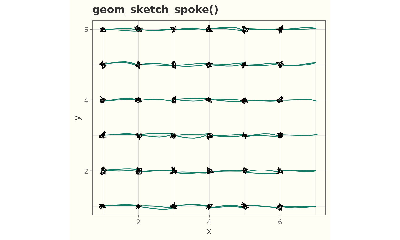
Rugs
geom_sketch_rug() adds marginal ticks along the panel
edges (sides).
ggplot(mtcars, aes(wt, mpg)) +
  geom_sketch_point(colour = "#2C3E50", seed = 1L) +
  geom_sketch_rug(sides = "bl", colour = "#7B241C", seed = 2L) +
  labs(title = "Scatter with marginal rug") +
  theme_sketch()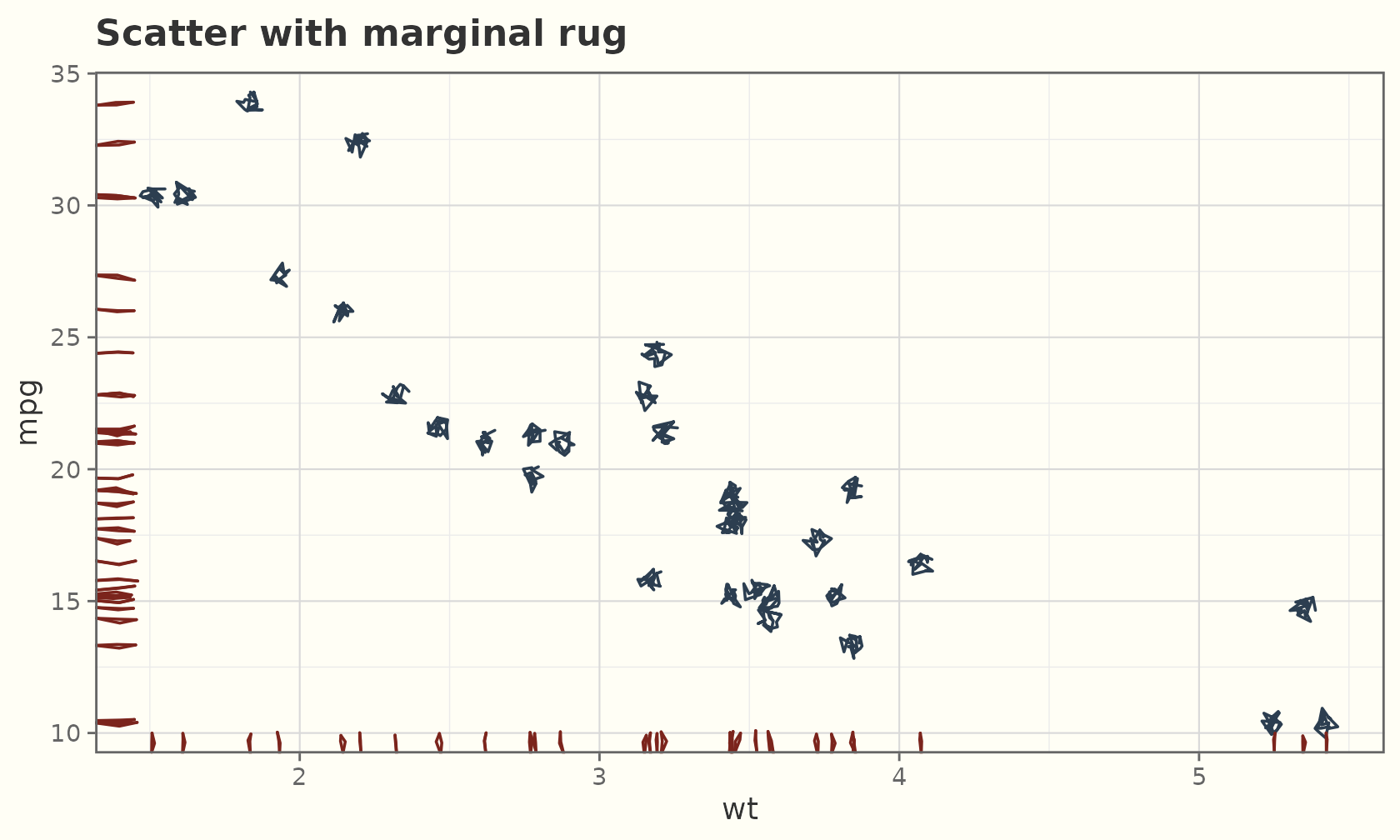
Intervals and uncertainty
The interval family draws hand-drawn ranges:
geom_sketch_linerange(),
geom_sketch_pointrange(),
geom_sketch_errorbar(), and
geom_sketch_crossbar().
est <- data.frame(
  group = c("A", "B", "C", "D"),
  mean  = c(4.1, 5.6, 3.2, 6.0),
  lo    = c(3.2, 4.9, 2.4, 5.1),
  hi    = c(5.0, 6.4, 4.1, 6.8)
)
ggplot(est, aes(group, mean)) +
  geom_sketch_pointrange(aes(ymin = lo, ymax = hi), colour = "#1F618D",
                         seed = 1L) +
  labs(title = "Point estimates with 95% intervals", x = NULL) +
  theme_sketch()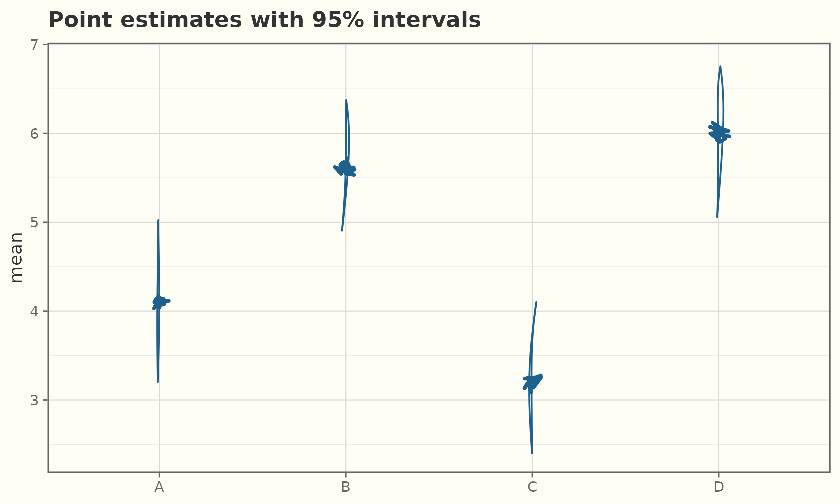
ggplot(est, aes(group, mean)) +
  geom_sketch_col(fill = "#AED6F1", width = 0.6, seed = 1L) +
  geom_sketch_errorbar(aes(ymin = lo, ymax = hi), width = 0.3, seed = 2L) +
  labs(title = "Bars with error bars", x = NULL) +
  theme_sketch()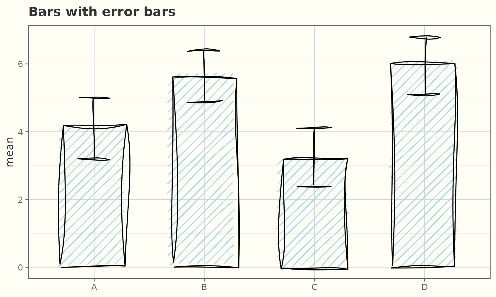
ggplot(est, aes(group, mean)) +
  geom_sketch_crossbar(aes(ymin = lo, ymax = hi), fill = "#FCF3CF",
                       fill_style = "hachure", seed = 3L) +
  labs(title = "geom_sketch_crossbar()", x = NULL) +
  theme_sketch()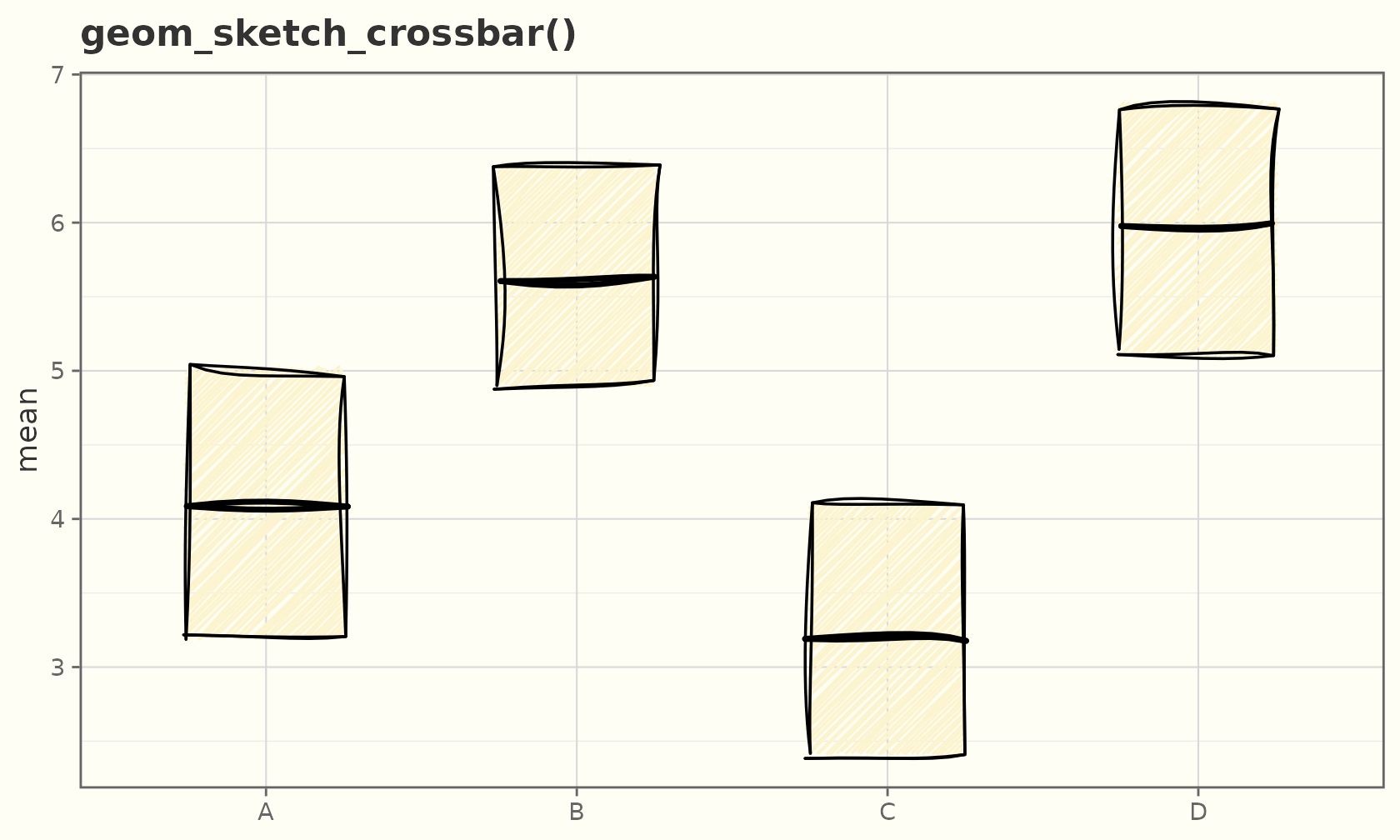
Reference lines
geom_sketch_abline(), geom_sketch_hline(),
and geom_sketch_vline() span the panel with a gentle
wobble.
ggplot(mtcars, aes(wt, mpg)) +
  geom_sketch_point(seed = 1L) +
  geom_sketch_hline(yintercept = 20, colour = "#C0392B", seed = 2L) +
  geom_sketch_vline(xintercept = 3.3, colour = "#2471A3", seed = 3L) +
  geom_sketch_abline(slope = -5, intercept = 37, colour = "#117864",
                     linetype = 2, seed = 4L) +
  labs(title = "Reference lines") +
  theme_sketch()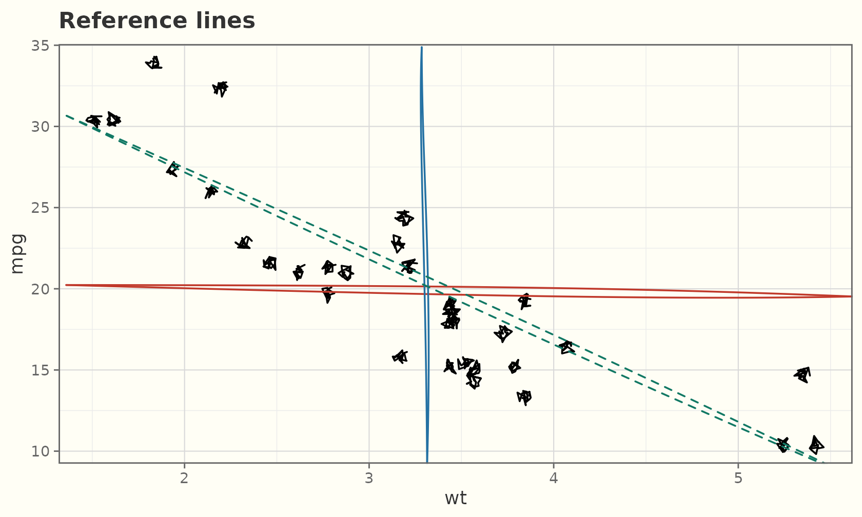
Contours and 2-D density
geom_sketch_contour() draws contour lines of a surface
(needs z); geom_sketch_density2d() contours a
2-D kernel density estimate.
ggplot(faithfuld, aes(waiting, eruptions, z = density)) +
  geom_sketch_contour(colour = "#2E4053", seed = 1L) +
  labs(title = "geom_sketch_contour()") +
  theme_sketch()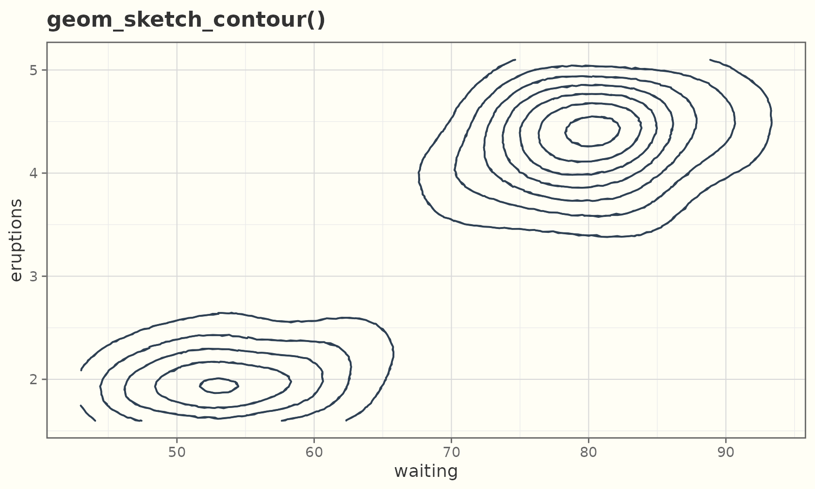
ggplot(faithful, aes(eruptions, waiting)) +
  geom_sketch_point(colour = "grey70", seed = 1L) +
  geom_sketch_density2d(colour = "#884EA0", linewidth = 0.7, seed = 2L) +
  labs(title = "geom_sketch_density2d()") +
  theme_sketch()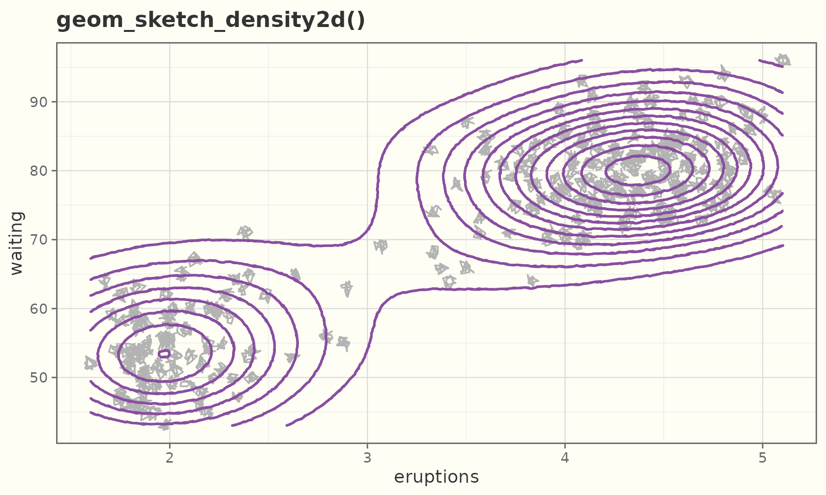
Text
The sketch of text is a handwriting font, not roughened
glyphs. geom_sketch_text() uses the first installed
handwriting face (and falls back to the device default otherwise).
lab <- data.frame(x = c(2, 4, 3), y = c(3, 4, 1.5),
                  txt = c("hand", "drawn", "labels"))
ggplot(lab, aes(x, y, label = txt)) +
  geom_sketch_point(size = 3, colour = "#C0392B") +
  geom_sketch_text(size = 7, nudge_y = 0.4) +
  labs(title = "geom_sketch_text()") +
  theme_sketch()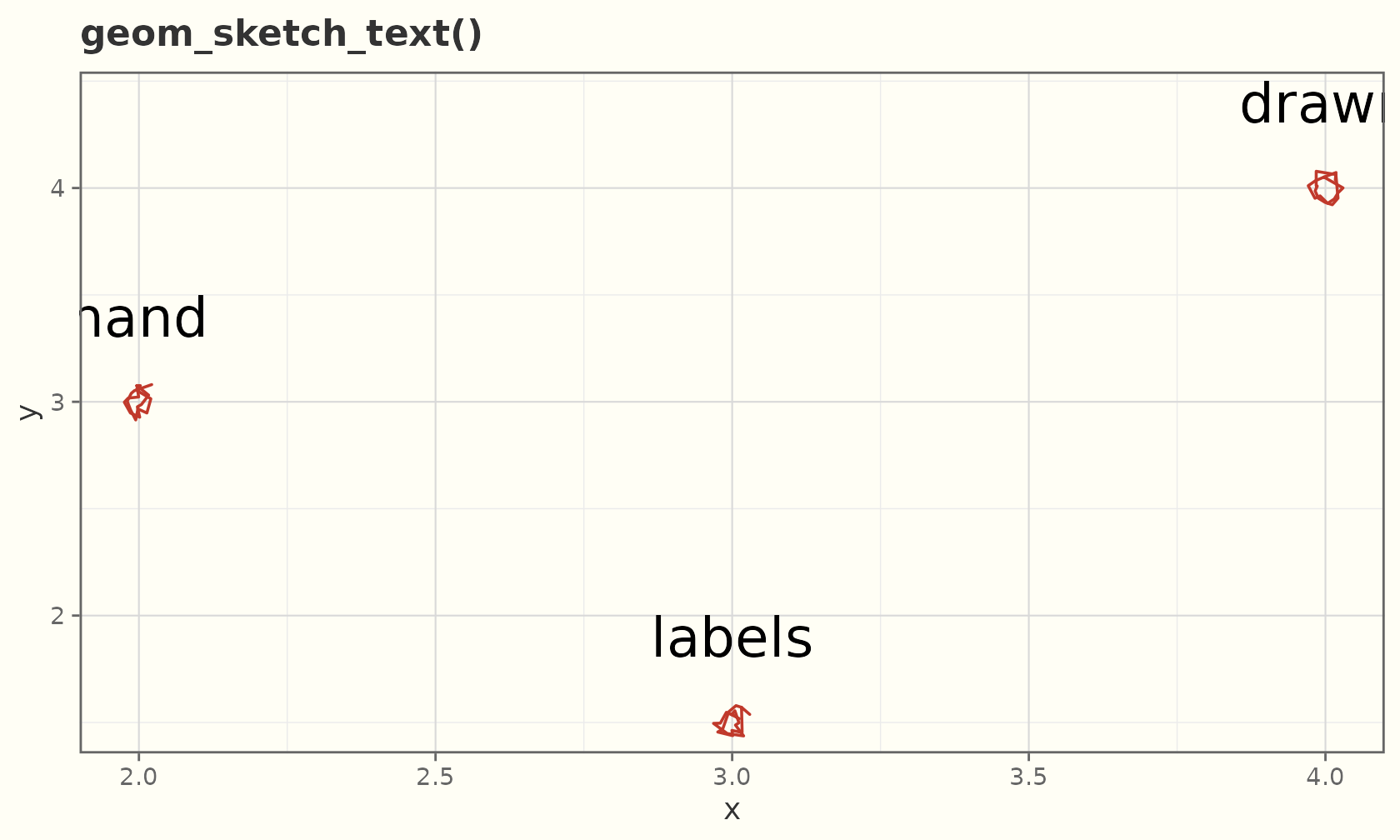
Boxplots
A composed geom: rough IQR box, thick median, whiskers, and sketchy outliers.
ggplot(mpg, aes(class, hwy)) +
  geom_sketch_boxplot(seed = 1L) +
  labs(title = "Highway mpg by class", x = NULL) +
  theme_sketch() +
  theme(axis.text.x = element_text(angle = 30, hjust = 1))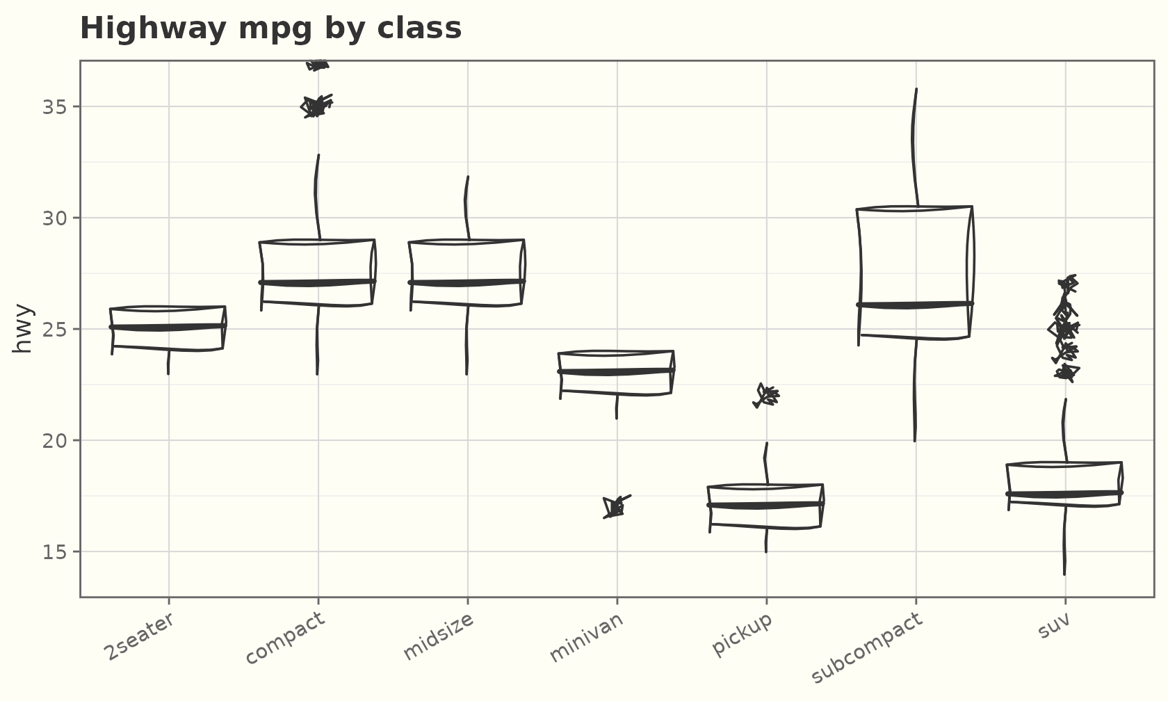
By default the box is outline-only (its fill is
NA). Give it a fill for a solid box, or map
fill and switch on a fill style for coloured, shaded
boxes:
ggplot(mpg, aes(class, hwy, fill = class)) +
  geom_sketch_boxplot(fill_style = "hachure", seed = 1L, show.legend = FALSE) +
  scale_fill_brewer(palette = "Pastel1") +
  labs(title = "Hachure-filled boxes", x = NULL) +
  theme_sketch() +
  theme(axis.text.x = element_text(angle = 30, hjust = 1))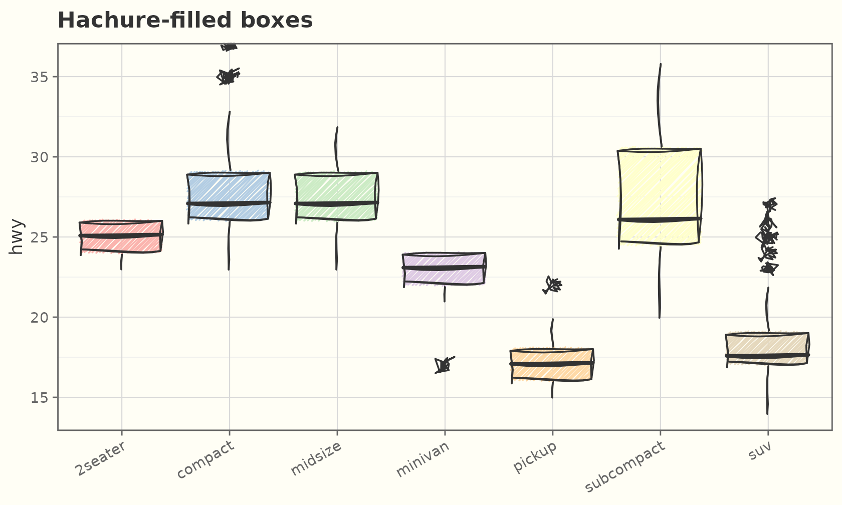
Annotations
annotate_sketch() adds one-off hand-drawn marks (no
aes() inheritance):
ggplot(mtcars, aes(wt, mpg)) +
  geom_sketch_point(seed = 1L) +
  annotate_sketch("rect", xmin = 3, xmax = 4, ymin = 15, ymax = 22,
                  fill = NA, colour = "red", seed = 2L) +
  annotate_sketch("segment", x = 2, y = 32, xend = 3.4, yend = 21,
                  colour = "blue", linewidth = 1, seed = 3L) +
  annotate_sketch("circle", x = 5, y = 30, r = 0.4,
                  colour = "darkgreen", fill = "green", seed = 4L) +
  labs(title = "Highlighting with annotate_sketch()") +
  theme_sketch()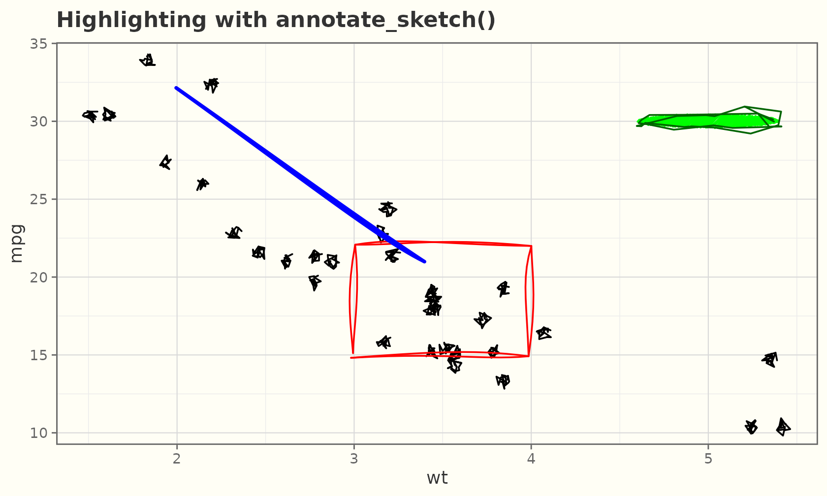
Significance brackets
geom_sketch_bracket() draws a hand-drawn comparison
bracket with an optional handwriting label, for marking pairwise
comparisons (a sketchy ggsignif).
brackets <- data.frame(
  xmin  = c(1, 2),
  xmax  = c(2, 3),
  y     = c(40, 45),
  label = c("p = 0.03", "n.s.")
)
ggplot(mpg, aes(drv, hwy)) +
  geom_sketch_boxplot(seed = 1L) +
  geom_sketch_bracket(
    data = brackets,
    aes(xmin = xmin, xmax = xmax, y = y, label = label),
    seed = 2L
  ) +
  labs(title = "Pairwise comparisons", x = "drivetrain") +
  theme_sketch()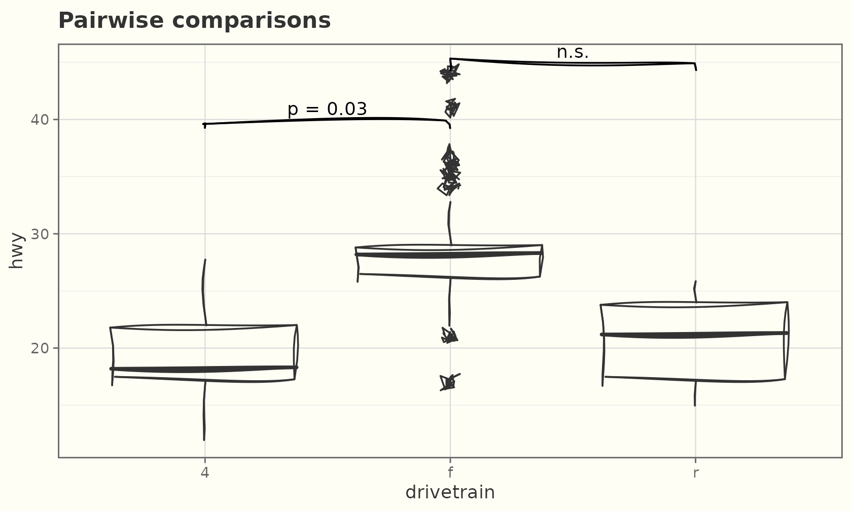
Composition: facets, scales, coords
Sketch geoms respect the full grammar.
ggplot(mpg, aes(displ, hwy)) +
  geom_sketch_point(size = 2.5, colour = "#34495E", seed = 9L) +
  geom_sketch_smooth(method = "lm", formula = y ~ x, seed = 10L) +
  facet_wrap(~drv, labeller = label_both) +
  labs(title = "Faceted by drivetrain") +
  theme_sketch()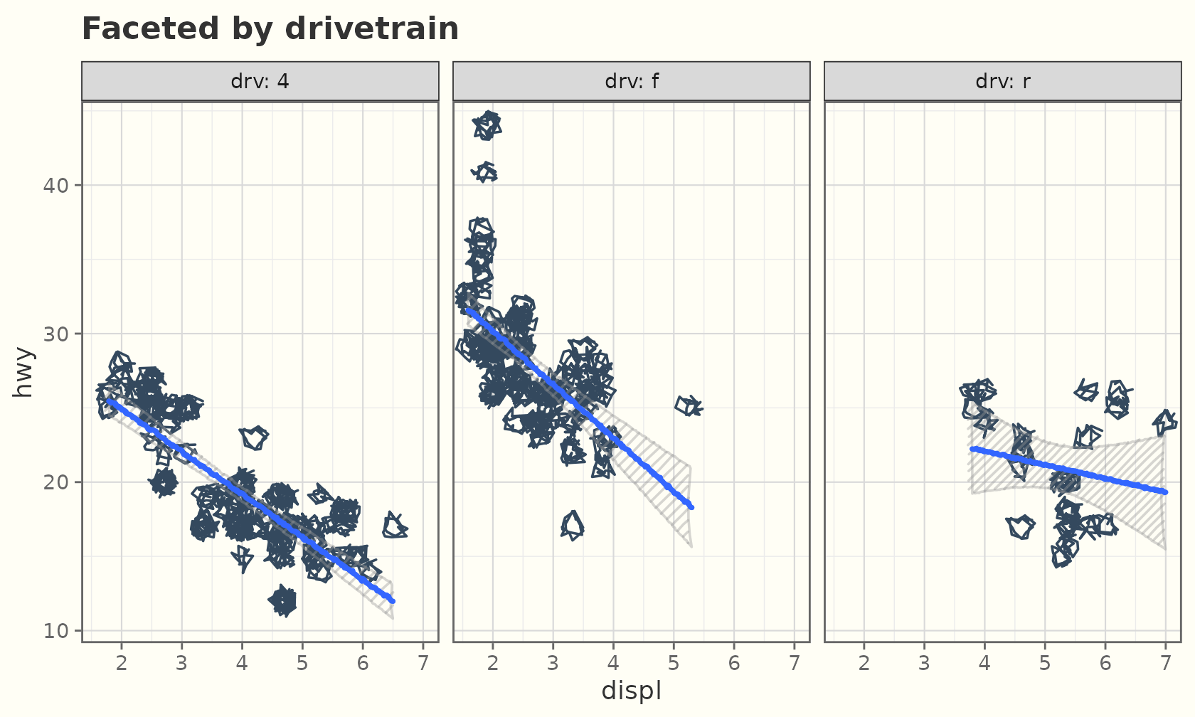
Dark mode
Every example above works with
theme_sketch(dark = TRUE):
ggplot(sales, aes(product, units, fill = product)) +
  geom_sketch_col(seed = 1L, show.legend = FALSE) +
  scale_fill_brewer(palette = "Set2") +
  labs(title = "Dark preset", x = NULL) +
  theme_sketch(dark = TRUE)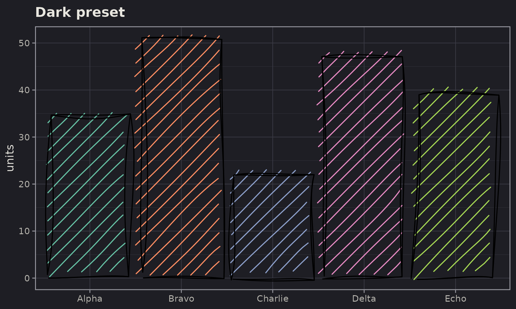
A hand-drawn frame
By default theme_sketch() keeps the gridlines, panel
border, and axis ticks crisp. Pass rough_frame = TRUE and
the frame is roughened too, so it matches the marks.
ggplot(sales, aes(product, units)) +
  geom_sketch_col(fill = "#7BAFD4", seed = 1L) +
  labs(title = "Everything wobbles", x = NULL) +
  theme_sketch(rough_frame = TRUE, seed = 1L)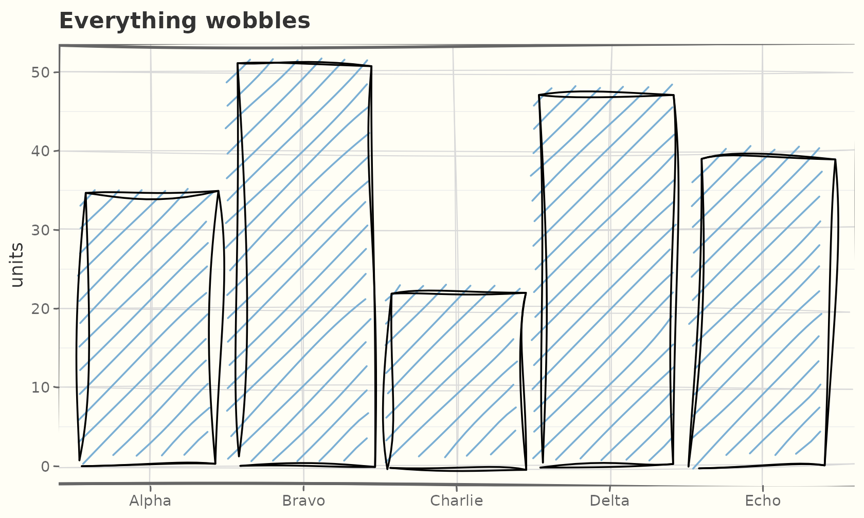
The roughened elements are real theme elements —
element_sketch_line() and
element_sketch_rect() — so you can also drop them into any
theme yourself and tune their roughness,
bowing, and seed:
ggplot(mtcars, aes(wt, mpg)) +
  geom_sketch_point(seed = 1L) +
  theme_sketch() +
  theme(
    panel.grid.major = element_sketch_line(roughness = 0.8, seed = 7L),
    axis.ticks       = element_sketch_line(roughness = 0.6, seed = 8L)
  )
A matching palette
scale_colour_sketch() / scale_fill_sketch()
use a qualitative palette (sketch_palette()) chosen to suit
the hand-drawn look:
ggplot(mpg, aes(displ, hwy, colour = drv)) +
  geom_sketch_point(size = 2.5, seed = 1L) +
  scale_colour_sketch() +
  labs(title = "scale_colour_sketch()") +
  theme_sketch(rough_frame = TRUE, seed = 2L)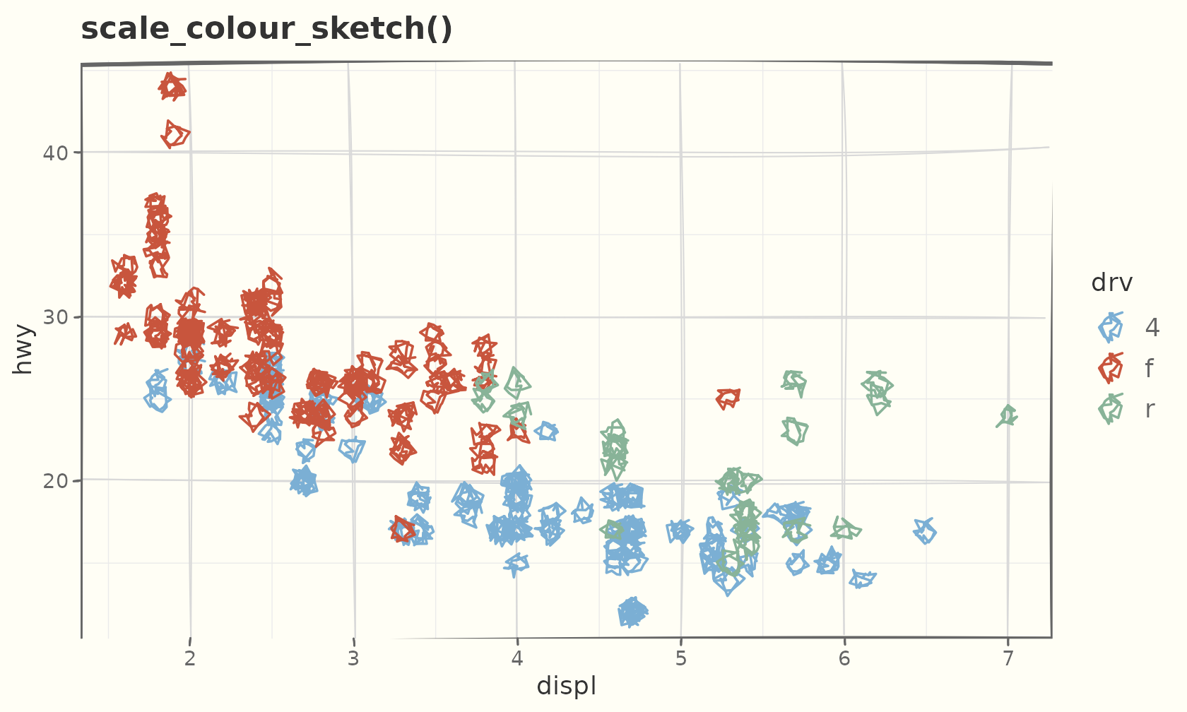
For continuous data the *_sketch_c() variants give an
ink-on-paper gradient:
ggplot(faithful, aes(eruptions, waiting, colour = waiting)) +
  geom_sketch_point(size = 2.5, seed = 1L) +
  scale_colour_sketch_c() +
  labs(title = "scale_colour_sketch_c()") +
  theme_sketch()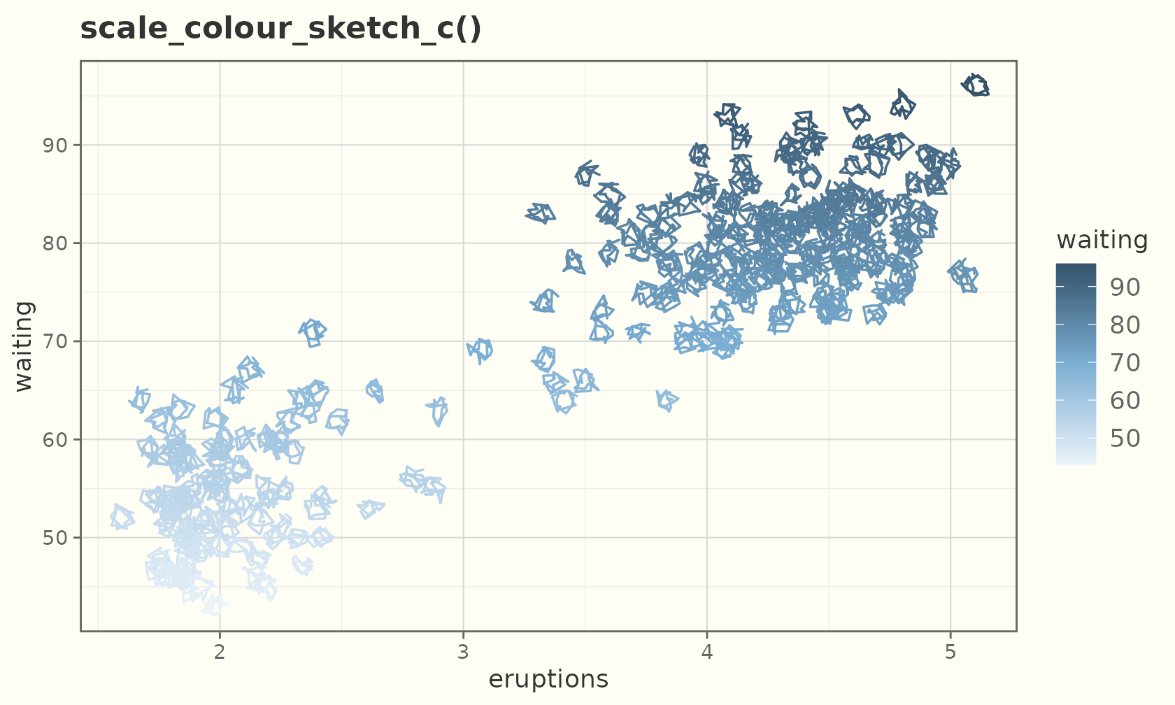
The scribble fill
"scribble" is one continuous winding stroke that
overshoots the boundary, like scribbling to fill a shape:
ggplot(sales, aes(product, units, fill = product)) +
  geom_sketch_col(fill_style = "scribble", seed = 3L, show.legend = FALSE) +
  scale_fill_sketch() +
  labs(title = "fill_style = \"scribble\"", x = NULL) +
  theme_sketch()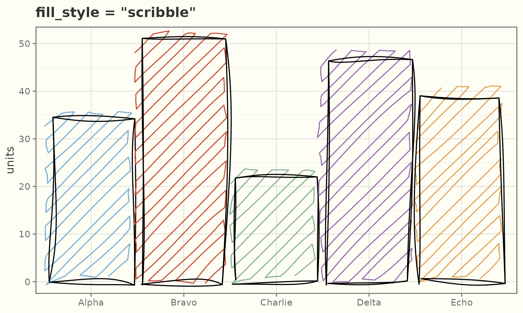
It works anywhere a fill_style is accepted. The eight
styles:
styles <- c("hachure", "cross_hatch", "zigzag", "zigzag_line",
            "scribble", "dots", "dashed", "solid")
grid <- expand.grid(col = 1:4, row = 1:2)
grid$style <- styles
ggplot(grid) +
  lapply(seq_len(nrow(grid)), function(i) {
    geom_sketch_rect(
      data = grid[i, ],
      aes(xmin = col - 0.45, xmax = col + 0.45,
          ymin = row - 0.4,  ymax = row + 0.4),
      fill = "#7BAFD4", fill_style = grid$style[i], seed = i
    )
  }) +
  geom_sketch_text(aes(col, row - 0.55, label = style), size = 4) +
  coord_equal() +
  labs(title = "The eight fill styles", x = NULL, y = NULL) +
  theme_sketch() +
  theme(axis.text = element_blank())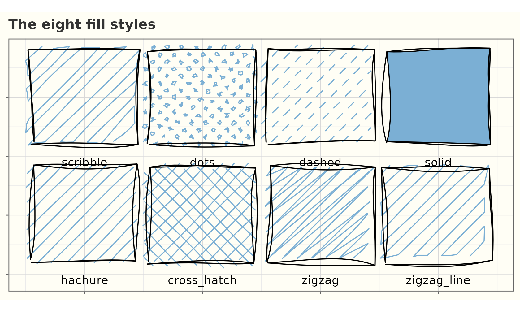
Reproducible handwriting fonts
geom_sketch_text() picks up a handwriting face
preinstalled on your OS, but for results that reproduce on any machine
or CI runner, register a font file explicitly with
register_sketch_font() and a font-aware device (ragg,
svglite, cairo):
register_sketch_font("Caveat", "path/to/Caveat-Regular.ttf")

ggplot(lab, aes(x, y, label = txt)) +
  geom_sketch_text(family = "Caveat", size = 8) +
  theme_sketch()