In use
Posters
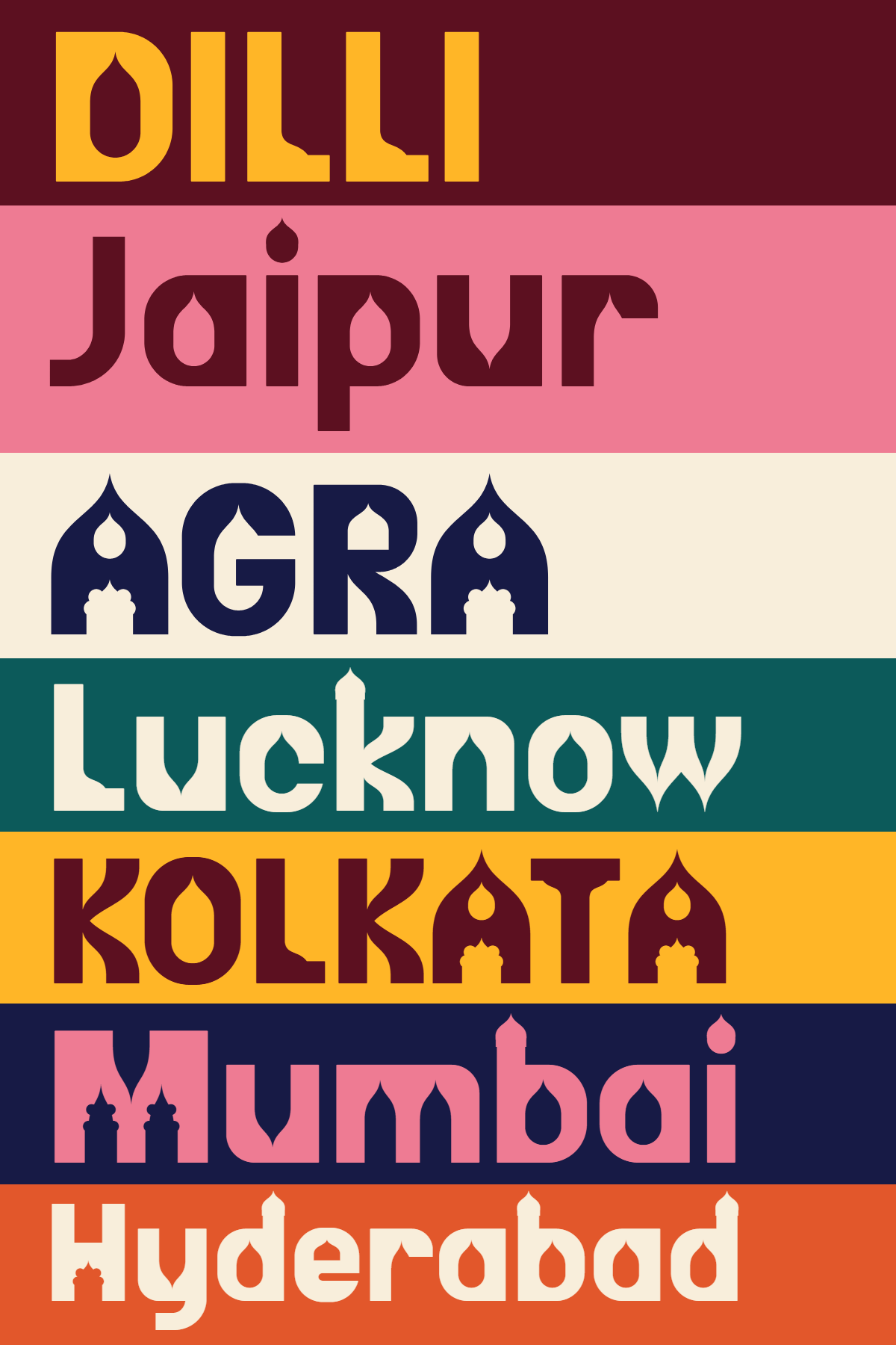
A few posters made for the release. Click one to see it full size. You are welcome to share them.
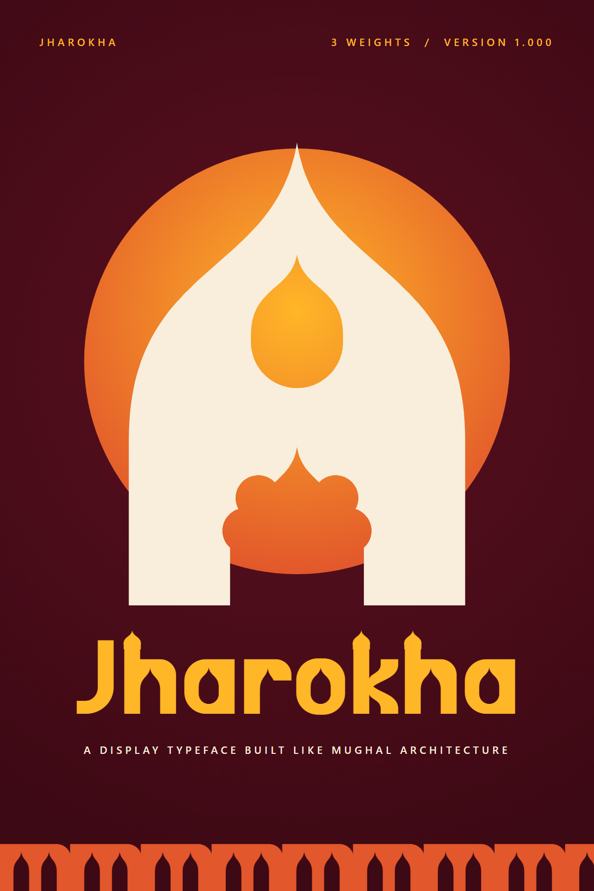
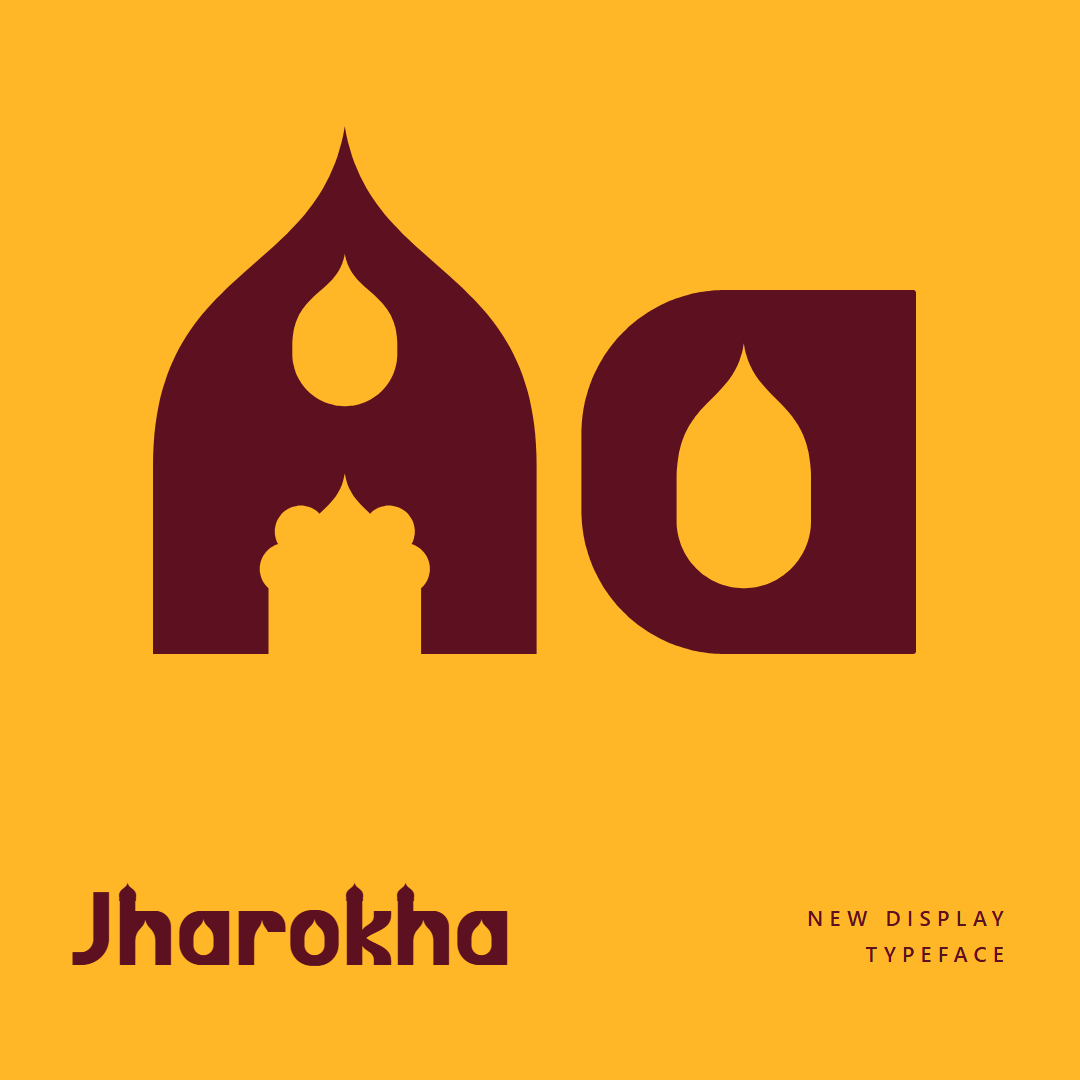
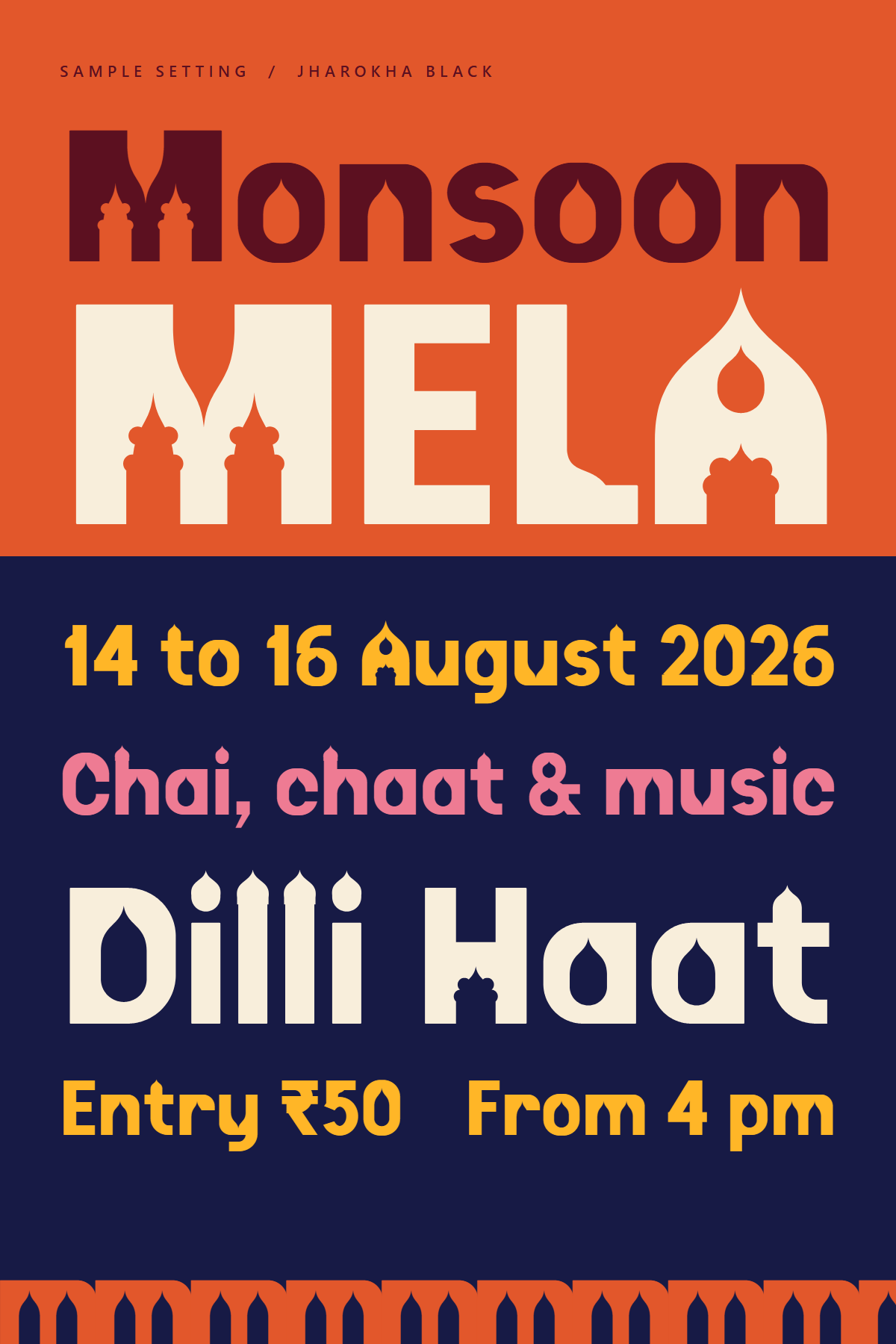
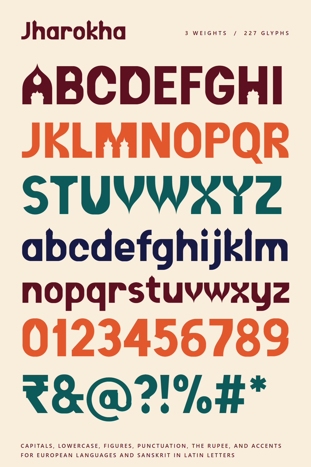
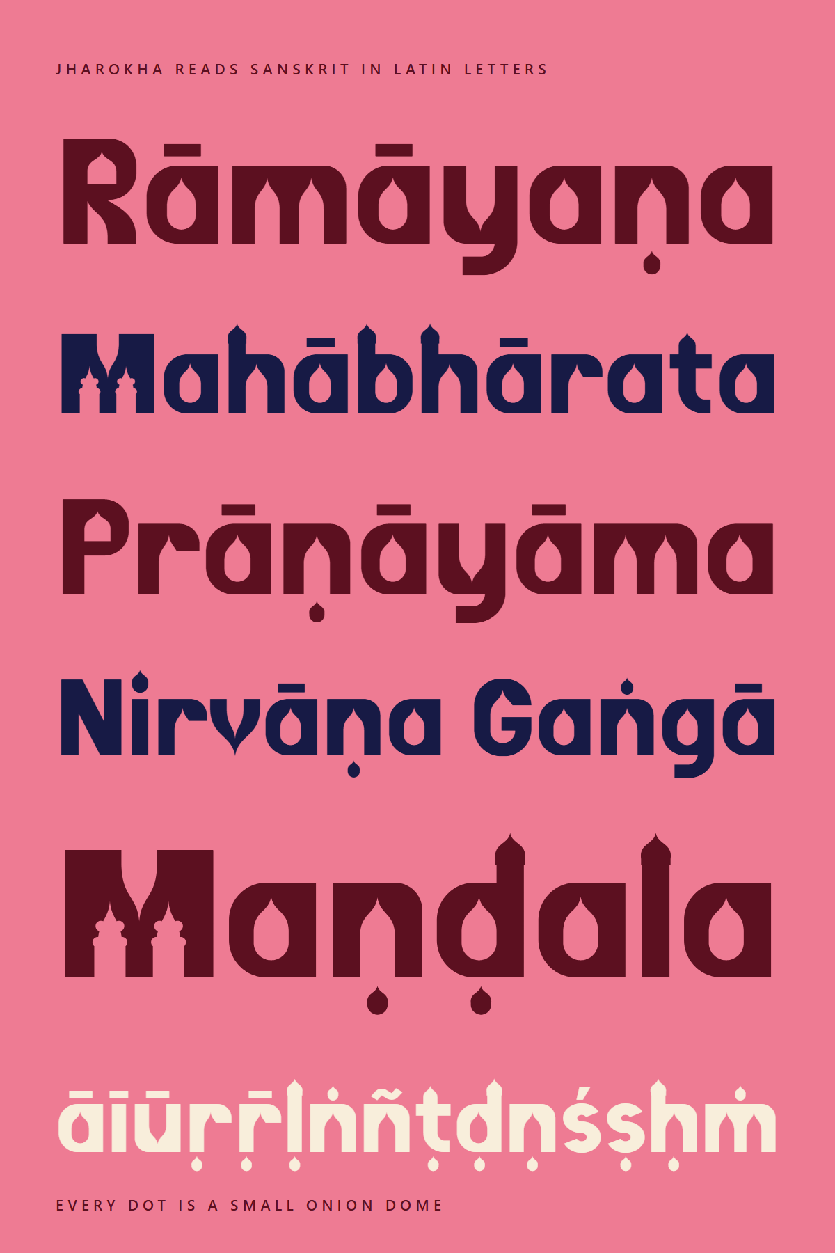
A free display typeface in three weights. The letters are Latin, but they are built like Mughal buildings, with arched doorways, bud shaped windows and small domes.
A jharokha is the stone balcony that hangs off the front of an old haveli or palace. The font takes its parts from buildings like that. Every letter starts as a solid block, and then the arches get cut out of it.
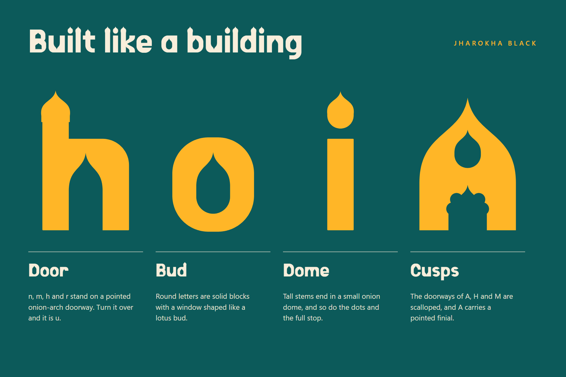
n, m, h and r stand on a pointed doorway. Flip it upside down and you get u.
Round letters are blocks with a window in the shape of a lotus bud.
Tall stems end in a small onion dome. The dots and the full stop are domes too.
Capital A, H and M get scalloped arches, and A has a pointed finial on top.
Lighter weights thin the masonry and widen the doorways and windows, so the architecture stays readable even when the type gets small.
At 20 px: Old Delhi doorways, lotus-bud windows & minaret domes stay open for subheads, menus and captions.
Every dot above or below a letter is a tiny dome, same as the dot on the i.
A few posters made for the release. Click one to see it full size. You are welcome to share them.
Download the zip, open it, and install the three .ttf files (Regular, Bold, Black). For a website, load the woff2 files:
@font-face {
  font-family: "Jharokha";
  font-weight: 400;
  src: url("Jharokha-Regular.woff2") format("woff2");
}
@font-face {
  font-family: "Jharokha";
  font-weight: 700;
  src: url("Jharokha-Bold.woff2") format("woff2");
}
@font-face {
  font-family: "Jharokha";
  font-weight: 900;
  src: url("Jharokha-Black.woff2") format("woff2");
}
h1 { font-family: "Jharokha", sans-serif; font-weight: 900; }